Software: Killer For All The Wrong Reasons
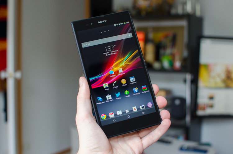
One of the most disappointing aspects about the Sony Xperia Z Ultra is the software. The phone runs a lightly skinned version of Android 4.2 out of the box, although it fails to bring all the necessary large screen optimizations to a device that desperately needs them.
With a 6.4-inch display in your hands, you want to be seeing more information that what you would get with a 5-inch, or 4.3-inch phone. The extra screen real estate allows more text, more images and more data to be seen at a glance, in a similar way to a 10-inch tablet is better for productivity than a 7-inch tablet. As the Z Ultra falls in between high-end phones and small tablets in terms of screen real estate, ideally you'd be wanting information density somewhere in between those two types of devices.
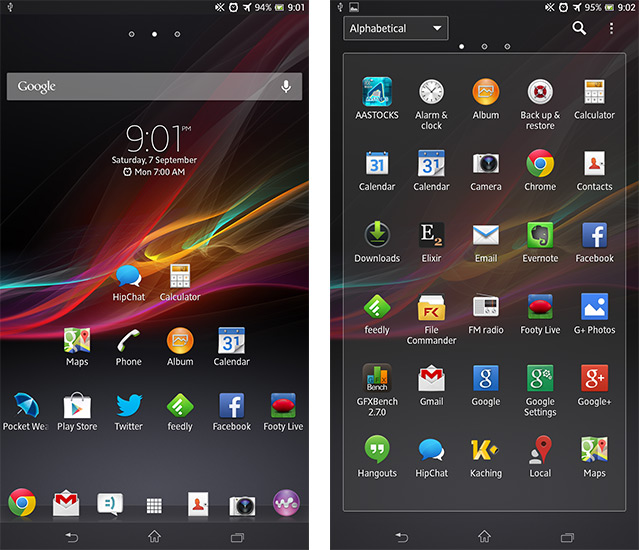
In some aspects, Sony has provided these optimizations, for example, instead of your regular homescreen layout of a 4x4 grid, the Z Ultra features a 6x6 gird, as well as six icons in the dock. This basically removed the necessity for me to use any more than one homescreen. Combined with a few lockscreen widgets, such as for emails and my calendar, I was able to see more information than I would on a phone like the HTC One.
The browser is another example of an application that is suited well to the large display.
Sony decided to bundle Chrome with the Ultra, rather than perfecting their own software, and it works well. Through gestures you can quickly swipe between tabs, and by rotating the phone I was often able to switch from a responsive mobile layout, to a full 1080p-optimized desktop layout. Thanks to the higher information density, I actually used the browser more often than I would have on a smaller device.
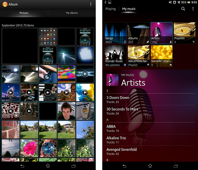
Sony's Walkman music player app is a piece of well-optimized software that should also be highlighted. The home pane of this app features a section of squares that select different subsections of your music, such as songs and artists, at the top, while the bottom has the list of whatever you've chosen. This layout makes managing and selecting music very easy, especially when you have a large collection. The app also contains a number of useful options, such as a quick button for finding artist info and music videos, which can come in handy.
So far so good, but other than those essentially every other app included with the Z Ultra is just a scaled up version of the very same application I saw on the Xperia Z.
In most cases, Sony has made little to no attempt at modifying these apps to make better use of the larger display, relying largely on UI scaling, rather than introducing elements that might be handy, but would otherwise not fit on the Xperia Z's 5-inch screen.
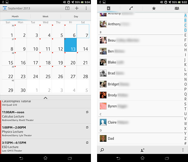
This leads to many apps being just a huge list, such as the contacts app. In this app, there are quick shortcuts to message or call contacts, or large contact pictures, or more information about the contact. Instead it's a long list of contact names, and clicking on any one of the contacts gives you another large list of information.
You see this again with the Calendar app: at the top is a standard grid calendar, but the information density is low. Sure you have an agenda below it, which you can resize, but at a glance it's hard to tell what you have on each day in the month, despite having enough screen real estate to show this. The notification pane is a similar story of low-density information on a large display, and it's really disappointing to see.
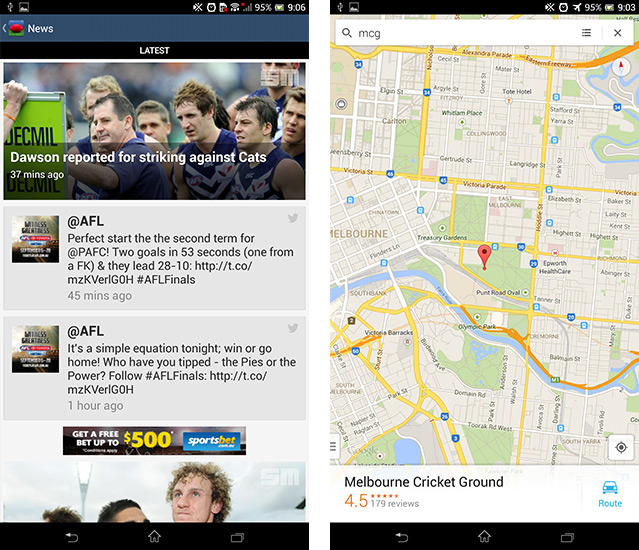
Unlike most smartphones in the 5-inch or less category, the Xperia Z Ultra basically requires you to set the font size to large (it is by default). Like with first-party apps and a lack of large-screen optimizations, it's font issues and strange scaling that kills third-party apps. A number of my favorite apps, such as one for the Australian Football League, feature fonts so large that it wouldn't trouble the elderly, while others are small windows on a massive display, or feature broken elements.
However, to be fair, a majority of third-party apps simply act like large smartphone apps or small-screen tablet apps, which is to be expected. Most of the time this is exactly what you want, like with the Twitter, Gmail and Feedly apps, and I wasn't really expecting any specific phablet modes in Play Store apps.
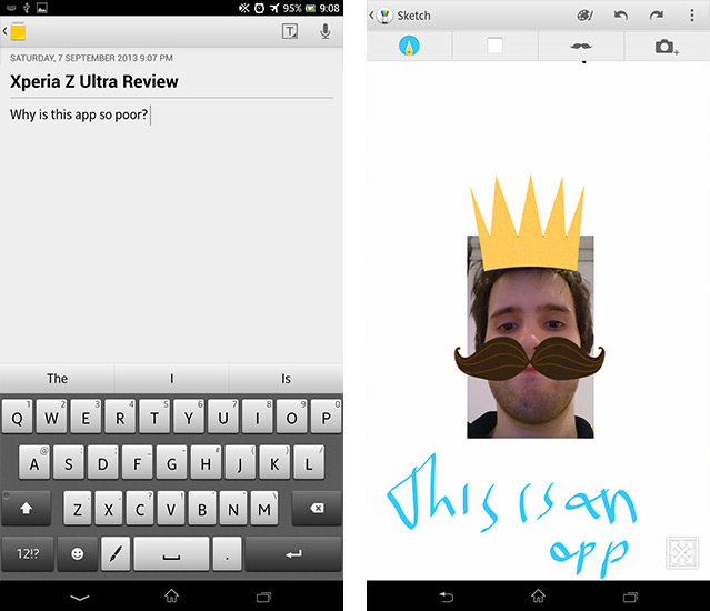
Another aspect of the software that's disappointing is the lack of a good first-party note-taking app. S Note is a fantastic Samsung-made inclusion on the Galaxy Note, and Sony's 'Notes' app is simply not up to scratch. Essentially, it's just a basic text input application, including some simple formatting options and the ability to take voice notes. Nothing special, and nothing that makes me want to use it over a third-party alternative such as Evernote.
Alongside the Notes app is a separate drawing application called 'Sketch', which again is a basic drawing app with different pen types, support for embedding images, and a few cool stamps. Why Sony didn't merge the Notes and Sketch apps together is beyond me, because the ability to take notes with the keyboard and then annotate them with a stylus is critical to productive note-taking. The phone even comes with a specific feature allowing you to use a pencil as a stylus for annotation, yet the note-taking app doesn't allow you to do this.
Like with a number of stylus-supporting smartphones, the Xperia Z Ultra has handwriting recognition. It's not faster, and it's not more accurate than using the keyboard, so like every other phone that has it, there is still no reason to use it. Enough said.
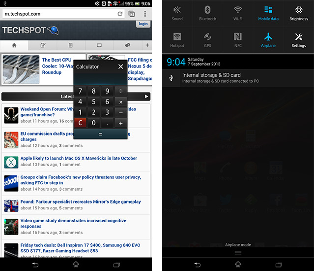
The final feature I'd like to mention is Sony's multi-tasking windows, which put a small version of some apps in a resizable window that you can move around the display. Accessible from the Recent Apps menu, the windowed versions of apps such as the browser, calculator and Notes can be handy, but I didn't find myself using them all that often. Often it was just easier, or it made more sense to switch between full versions of apps using the task switcher, and the limited selection of windowed apps didn't really fit with my general phone usage.
At the end of the day, Sony's implementation of software on the Xperia Z Ultra is poor. Apps and the interface aren't optimized for the 6.4-inch display, and the lack of a strong note-taking app on a phone built (in part) for note-taking is extremely disappointing. Sony's skin may be visually appealing in some respects, but it's the lack of features that really lets the software down.
