Rumor mill: Google introduced the Material 3 Expressive design with Android 16, earning high praise from many power users and reviewers. However, a series of leaked screenshots now suggests that the next version of Android could abandon the current design in favor of a new look that borrows heavily from iOS 26's controversial Liquid Glass UI.
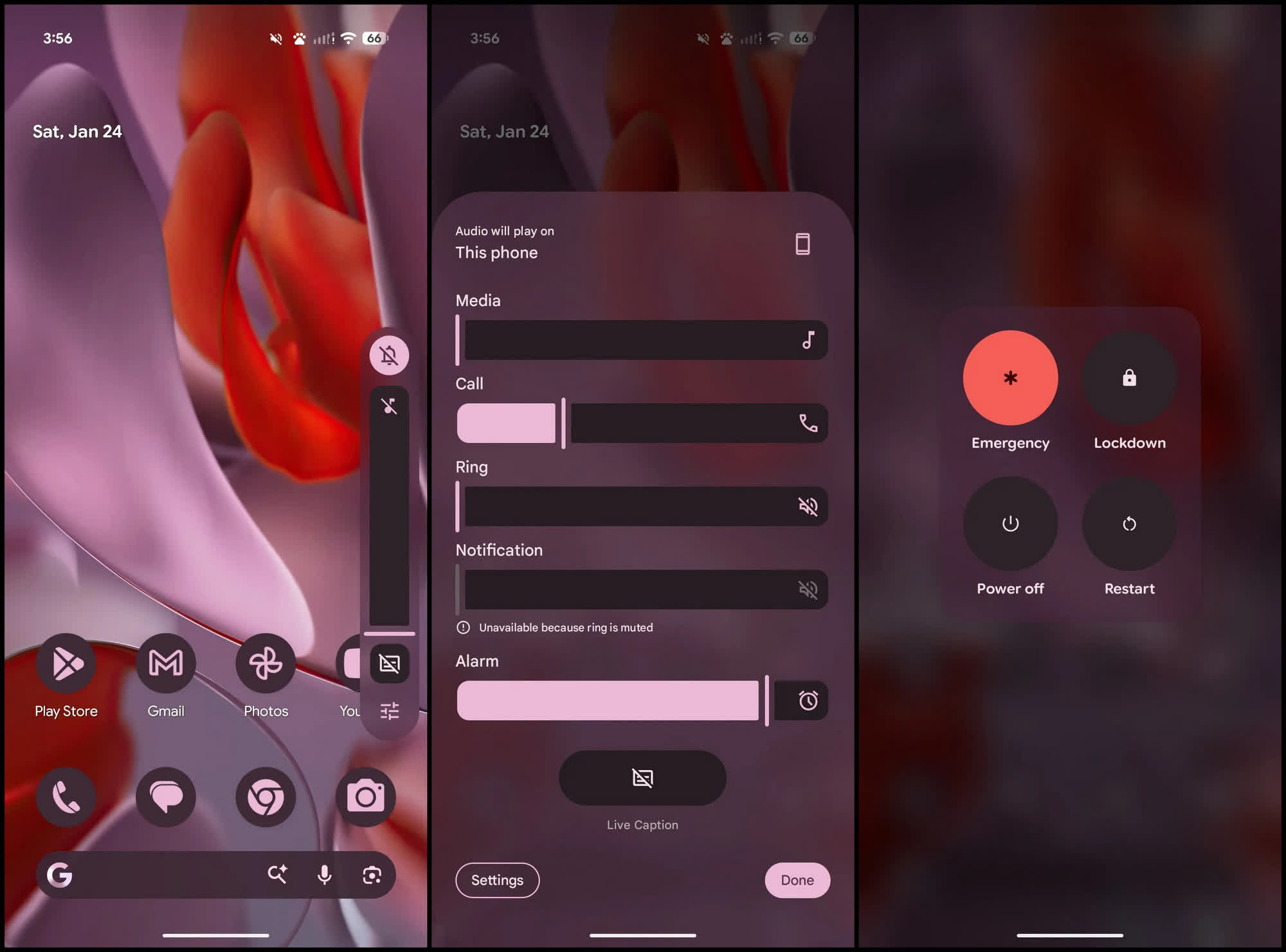
Tipster MysticLeaks recently posted – and later deleted – a series of screenshots on Telegram that appear to show background blur effects applied across much of Android 17, echoing Apple's Liquid Glass UI in iOS 26.
However, the screenshots suggest that Android 17's blur effects will be more restrained than the aggressive, frosted-glass look seen in iOS 26.
Android 16 introduced limited translucency in the notification shade, quick settings menu, lock screen, and app drawer, while other interface elements – such as the volume panel and app shortcuts – rely on solid background colors dynamically derived from the wallpaper. Android 17 reportedly abandons these solid backgrounds in favor of a system-wide frosted design, extending blur effects to components like the power menu and volume slider.
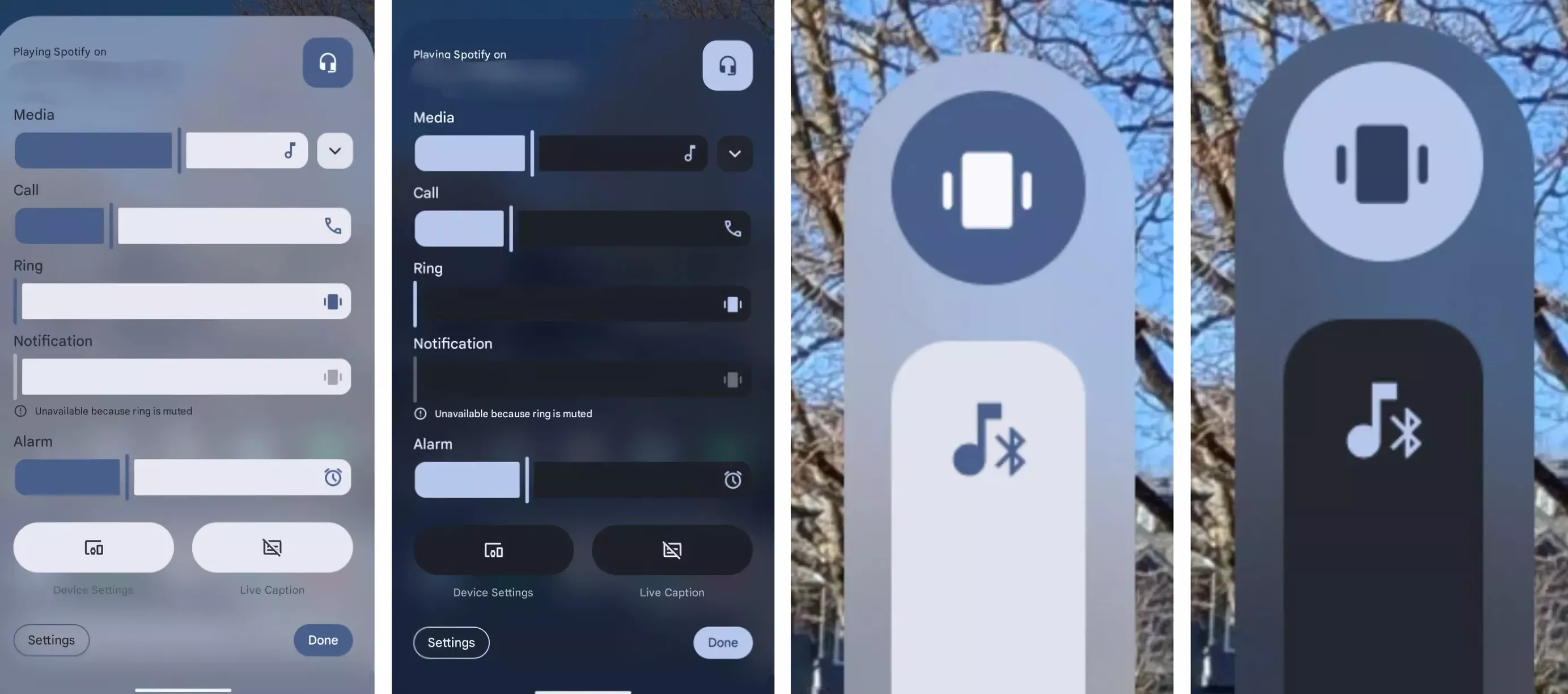
Another notable UI change in Android 17 is a floating pill interface for audio and microphone recording controls, replacing the current pop-up menu. The revamped screen recording tool is also reportedly gaining new features, including the ability to doodle on recordings and preview clips before sharing.
Android 17 is additionally expected to introduce a split design for the notification panel and Quick Settings, another iOS-inspired feature. Despite these borrowed design elements, Android 17 appears to be a relatively minor update in terms of functionality, with most components operating similarly to their Android 16 counterparts.
Apple's Liquid Glass UI, introduced with iOS 26 last year, divided users and reviewers. Some praised its frosted look, likening it to Windows 7's Aero translucency, while others complained that the glassy, refractive effects caused visual strain, increased GPU workload, and could slow animations or reduce battery life.
It remains to be seen how Google will implement the translucent effects without drawing too heavily from Apple's design. If executed well, however, the new UI could provide Android with much-needed visual polish, despite the uncanny resemblance to iOS 26.
Android 17 leak reveals a translucent design similar to Apple's Liquid Glass UI


