Logitech to focus on design, starting with a brand new logo

Scorpus

Posts: 2,162   +239
Staff member

Logitech has decided that it's sick of their old, outdated brand, today launching a new look for the company that will supposedly place "design at the core" of its products, while building on its "hertiage as a technology company".

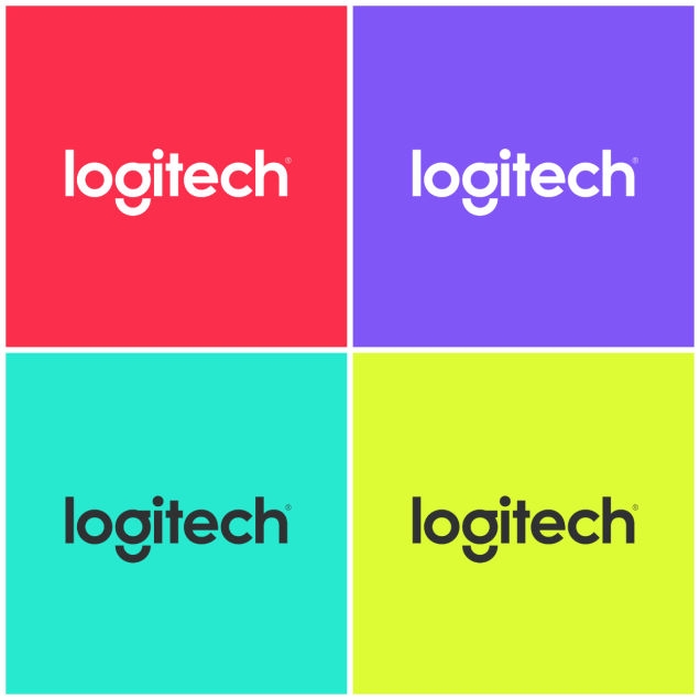
The new look for Logitech starts with a new logo, accompanied by a vibrant color palette that is very reminiscent of Nokia's smartphone line. But that could just be because Logitech has hired Alistair Curtis, Nokia's ex-design chief, to be the company's new Chief Design Officer.

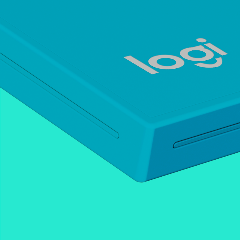
Logitech is also launching a new label for "select products in existing categories", simply called "Logi". It's not quite clear what products will feature the Logi brand, though the company says we should expect some "twists and a few surprises" in new product categories.

The company also says that vibrant colors and simple designs will be a feature of their in-store displays and product packaging, and you'll probably see what they mean when you watch their eyeball-scorching marketing video for the new brand we've attached above.

Permalink to story.

 
Nothing wrong with the logo, except the "g" that is hurting my brain.
 
Man, I really am (was?) a big fan of their products - nothing more than simple, plain black keyboards and mice, but with the quality, usability and plenty of various models suited for different tasks they were perfect for work with in my studio. Right now I'm surrounded by three Logitech keyboards (two wireless, one with embedded touchpad) and they do they job perfectly. I'm a bit afraid that this will end when Logi will only offer colorful, flashy stuff, focusing more on different color schemes than different features on different models. Oh well...
 
As the guest above said, nothing but fluff. They should focus on quality and not image (image has long been established).
I can say with certainty that with the Sh!t quality they have been releasing as of late, I will not be purchasing anything else from them. So I guess that also means I don't care what kind of colors they choose - but darn...those neon colors are killing my eyes! Which makes me wonder if they recently (last 1-2 years) replaced their CEO?? Cuz that's about when they started going down the tube for me.
 
Their products were fine, more reliable than many but in recent years they haven't really had a grand slam with any of their products. Nothing wrong with being "old dependable", in fact there is a nich market for that sort of thing. They need to stick to the quality and forget the "sexy" appearance; we've already got enough of those companies!
 
As I see it, this is an example of what companies do that are blind to their own internal faults. However, I think we have crApple to blame for the focus on design. If logitech drops their focus from quality to design, this will be another failed attempt at improving the bottom line.

I've been a dedicated logitech user through the years, and just recently purchased a G910 keyboard and a G602 mouse. I am extremely impressed with the quality of the G910, and the G602 has a good feel to it. If, however, they were in bright neon colors, I would have thought twice about buying them, and may have looked elsewhere. I will also echo the comments from the Guest above in that I think they should keep their focus on quality and not on the fluff of design.
 
Logitech makes good products
and really did feel outdated and a bit on the side of everything
unused potential so this seems the right thing to do
 
Hmm I hope this doesn't mean quality is going to go down the crapper. I've been a long time user, and just about every input device I own is Logitech. They just work, and don't break. That is what I like... if that changes I'm out.
 
It's OK, I guess... as long as their top priority is quality and features, then design. I'm still waiting for the replacement of the Z906 sound system with support for DTS HD Master Audio.
 
I can't stomach neon and other bright colors for peripherals. It seems infantile to have a desk full of these products making it look more like a 5-year olds' compilation. I want professional looking and consistent products such as Logitech has always had up till now. Change the logo if you want, but keep the old black color scheme and keep the focus on continued innovation and quality. I've used nothing but Logitech products for 10 straight years and would hate to have to go to another manufacturer just because the company hired a previous Nokia exec.
 
CEO Logitech: "Now let's see, how to make more money? We could invest in new technologies, and produce high quality, durable hardware that really gives people value for money... Or we could just adopt a new name and logo. Put it like that, it's fairly simple."
 
Watching that sh~t I feel like I suddenly don`t trust them anymore. All the above comments are spot on. Everyone`s desperately trying to copy paste Apple instead of building on their own established identity. Flashy colors, round edges, minimalistic design, it`s that simple, right?
 
Back