In context: Microsoft knows that change can be disruptive. With a staggered rollout, Redmond can acclimate customers to the changes and better control any potential pushback. It's a cautious approach but with more than a billion monthly users, it's a safe play.
Microsoft on Wednesday announced a series of changes in store for its Office suite of productivity applications. Inspired by a new culture of work, the changes are designed to meet the demands of customers who tell Microsoft they love the power that Office apps deliver but would prefer a simplified user experience.
To ensure they get it right, Microsoft developed three guiding principles to “use as a north star” that’ll include direct customer feedback, understanding the context you’re working in and controlling the experience.
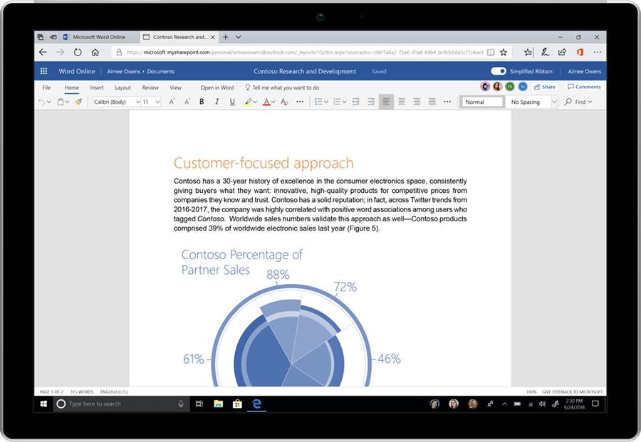
It starts with a simplified ribbon that’s meant to help users focus on their work and collaborate naturally with others. With the redesign, the traditional three-line ribbon has been shrunk down to a single line with more pops of color to help command icons better stand out.
Speaking of colors, users will also start to notice new colors and icons across Office apps that are built as scalable graphics meant to both modernize the experience and make it more accessible.
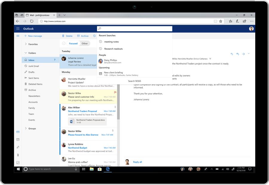
Microsoft wants search to be a much more important element of the user experience. As such, simply placing your cursor in the search box will trigger a “zero query search” with recommendations power by AI and the Microsoft Graph.
The changes won’t happen all at once, but will instead be deployed over the coming months to select customers in stages so Microsoft can gauge user feedback and adjust accordingly. Features will only become generally available once they’ve successfully navigated rigorous rounds of validation and refinement, says Jared Spataro, corporate vice preside for Office and Windows marketing.
The refined ribbon and new colors / icons will first appear in the web version of Word for Office.com. The changes will spill over to select Insiders later this month and into July and August while commercial users can see the new search functions in select products from today.
https://www.techspot.com/news/75075-microsoft-redesigning-office-simplify-user-experience.html
