Microsoft is replacing Windows 10's Volume Mixer

midian182

Posts: 9,662   +121
Staff member
In brief: Most Windows users know that the quickest and easiest way to alter the volume of individual programs and apps is to open the volume mixer, which is accessed by clicking the taskbar’s speaker icon. But it seems that this legacy option might be removed in future versions of Windows 10.

With the Volume Mixer, users can, for example, turn down the volume of any open browsers while making apps such as Spotify louder. It’s an easy-to-use and helpful feature within Windows 10, but it appears to be on the way out.

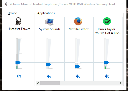
As spotted by users of the latest build (18272) available to Windows Insiders on the Fast Ring, Microsoft has updated the Volume Mixer. First reported by Windows Latest, it seems that right-clicking on the taskbar’s speaker icon still brings up a menu containing the ‘Open Volume Mixer’ option, but selecting it now opens the App Volume and Device Preferences page in Settings.

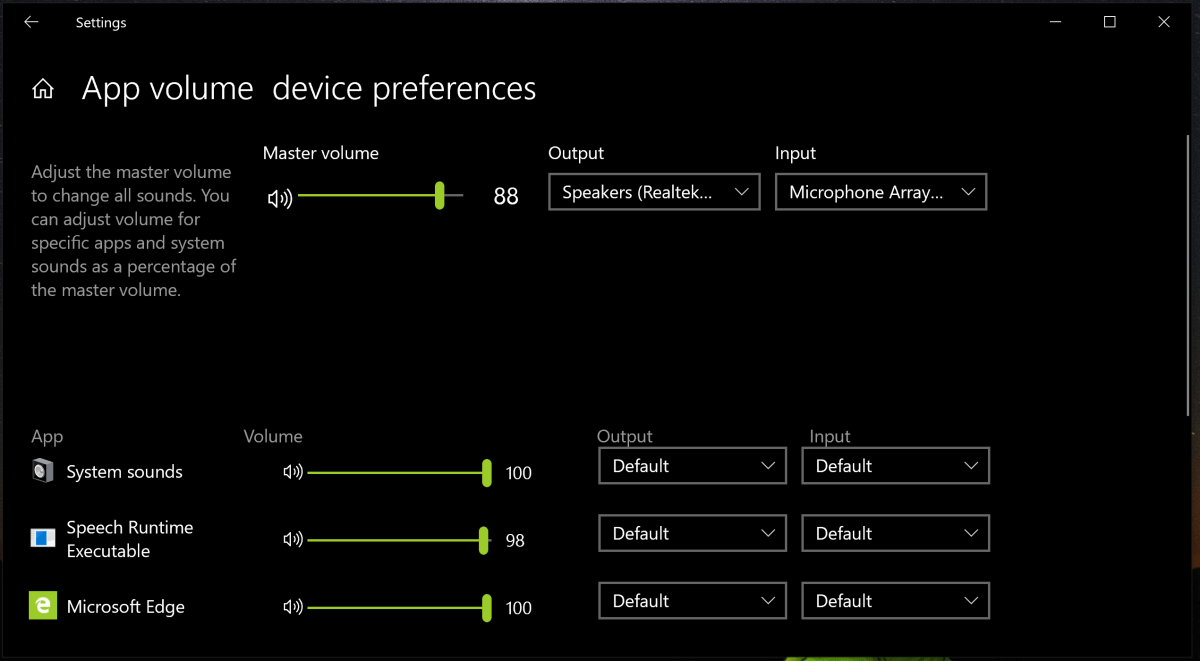
The volume preferences page has been available in Settings for a while, but Microsoft is now directing users toward it when they attempt to access the old Volume Mixer. Users can still manually set the sound levels for each open app, as well as change the sound inputs and outputs for individual applications—one program’s sound could be output through your headphones, while another could come through your speakers.

The Volume Mixer can still be accessed in this Windows build, though it involves using the Control Panel or by searching for SndVol.exe in Cortana. With this latest change, it seems that Microsoft could eventually do away with the old feature altogether.

While the App Volume and Device Preferences page offers more options than the Volume Mixer, many users aren’t happy about the move. What do you think?

Permalink to story.

 
Output and input thing might be useful and it's black without additional effort so that's nice but it seems to take more screen space than necessary. Also seems to be missing the bar that shows the loudest level.

You run your audio trough the monitor and at 100% volume? Wow.
 
Sounds about right you have the old guard being replaced with these young kids. That never used anything but a touch screen product and want to remove great features just so everything is forced to do it their way.
 
Yeah I agree on the UI being lame and bloated, it looks to be designed to be bloated so fingers can hit one slider at a time. Wish their was a choice between touch and mouse. BUT I have been waiting a hot minute for the ability to natively change the output of each application individually to different devices. So I am excited.
 
Why not replace an efficient non-obtrusive volume settings window with a full settings window that move the vertical sliders to horizontal, wastes almost all the space of a much, much larger window that will appear over whatever you have on the screen, instead of being a small window in the corner. If the change simply put a small version by the notification tray I'd be all for it. This is asinine.
 
What do I think? I think I'm tired of 'Windows as a Service", from Microsoft this means;
"Microsoft has reimagined each part of the process, to simplify the lives of IT pros and maintain a consistent Windows 10 experience for its customers. These improvements focus on maximizing customer involvement in Windows development,..."
I found that previously when there was a OS release things were simpler. Buy a book, learn about the parts that are hard for you, learn how to use fully what you have. Now with Windows 10 it seems like a permanent beta project, no documentation, no book can be written to keep up with often random changes, small changes the community pleads for are ignored for things of questionable value to most. Apps change functionality at the whim of MS, I could go on, but I won't
 
All part of Microsoft's "Modern Design" - If it doesn't contain at least 80% pointless white space, it's "old fashioned". Or something.
I can't help but feel they're trying to emulate Apple.
I disagree, why?
Well Apple's menu (System Preferences) is fixed, most of the time it is a bless, rarely a pain in my ***.
I wish Microsoft optimise the 'old' Control panel to have a fixed window (and an option to turn it off) to show up icons or groups.
For the bloated tablet stile 'Settings' menu, ohh god waste of space, icons are huge, can't be scaled.
While it is better to use on a device with touchscreen but still a pain. Be fixed and scale with windows size or can't be scaled at all and be like 30% percent of the actual screen size...
When I say that they're trying to emulate apple I mean in looks, I'm not sure the functionality is so much a concern as is making it appear more modern. The Skype For Business program is a great example of how little they understand (modernized look with reduced functionality). SFB is just a reskinned Lync that they somehow made worse.
 
I like this change. I use the volume mixer all the time and instruct others on how to use it (especially for audio recording).

It's a rather old and counter-intuitive design compared to modern equivalents.
 
I like this change. I use the volume mixer all the time and instruct others on how to use it (especially for audio recording).

It's a rather old and counter-intuitive design compared to modern equivalents.

I completely agree. The old volume mixer was one of my least favourite user experiences.

I also don't necessarily agree that the changes Microsoft is making are "change for change's sake." I have been using Windows for a long time, and have, for the most part, really been enjoying the newer UI.
 
That has improved the UI, no question. I don't know how many times I've had to show staff that tiny little pull-down in the old interface to select an output device. Hundreds? It's not evident to people who don't spend their lives reading about these things.

I welcome any change that improves a bad interface, and calling it "change for change's sake" is simply another vote for "don't change anything...I likes it the way it WAAAAASSSS!."

What "little pull-down"? Do you even USE Windows? You open the new interface in exactly the same ways as the old one - its just a less efficient version of what we had before.
 
I hate the new "Settings" in Windows 10. They haven't even finished replacing all the Control Panel applets, but the ones they have replaced have limited functionality. Sure, it looks pretty and is easier to use on a touchscreen but why can't they simply have an advanced section for each tab and a condensed view for monitor users? This whole one size fits all design is terrible for desktop users and most laptop users.
 
What do I think? That Microsoft should have made separate two separate OS, 'touch' and 'desktop'.
what were they thinking? To have Windows OS and Windows Phone work in tandem? Yes, they probably were and as their phone is in the toilet we are left with a half-assed OS that pleases neither the touch screen folks nor those who want an OS that functions fully with mouse and keyboard (and has no crap like 'Candy crush or whatever).
For example the whole 'menu debacle'. Tiles work fine I'm sure for touch, but my eyes can scan an alphabetical text list of applications much faster to use the mouse.
 
Pretty positive I've seen this new gui for the volume panel in build 1809 you just need to dig for it because it's a bit hidden in the "Settings" but I'm almost certain it's there as we speak. I'm not digging for it again, I just happened to find it when I was turning all of microsofts garbage off.

everyone who dislikes this being forced on them can download "winaerotweaker" the program has the option to enable the old windows 7 style volume control panel, and much more. it's free with no ads, give it a go :D.

don't quote me on this but I'm sure if the developer was asked, he would create the "old windows 10 style" volume control panel option in order to counteract this new gui that's coming out if u prefer the original windows 10 style. he takes feedback quite well.
 
Last edited:
Back