Microsoft rumored to be planning a Fluent Design revamp for Windows 10's File Explorer...

Polycount

Posts: 3,017   +590
Staff
In brief: Windows 10's operating system-wide Fluent Design visual facelift has made its way to several Microsoft apps and services, but that may not be good enough for the tech giant. According to new reports, Microsoft is allegedly planning to bring Fluent Design principles to File Explorer in 2020, as well as a few other more functional improvements.

Microsoft's Windows-as-a-service model has had plenty of hiccups over the years, but it's clear that the company will be sticking to the concept for quite a while.

The service-based operating system idea means new feature updates and bug fixes for users, but it also means we get to enjoy -- or hate, depending on your preferences -- occasional OS redesigns over time.

Lately, those visual facelifts have come in the form of Fluent Design (Microsoft's internal design language) oriented UI upgrades to existing Windows 10 apps, such as Outlook. These redesigns somewhat controversially place minimalism and convenience above everything else.

Now, a report from HTNovo suggests Fluent Design could be making its way to Windows 10's File Explorer as soon as next year as part of the OS' 20H1 update.

We don't know for sure what the facelift will look like, but non-official concept art from designer Michael West lays out some interesting possibilities. See that art below.

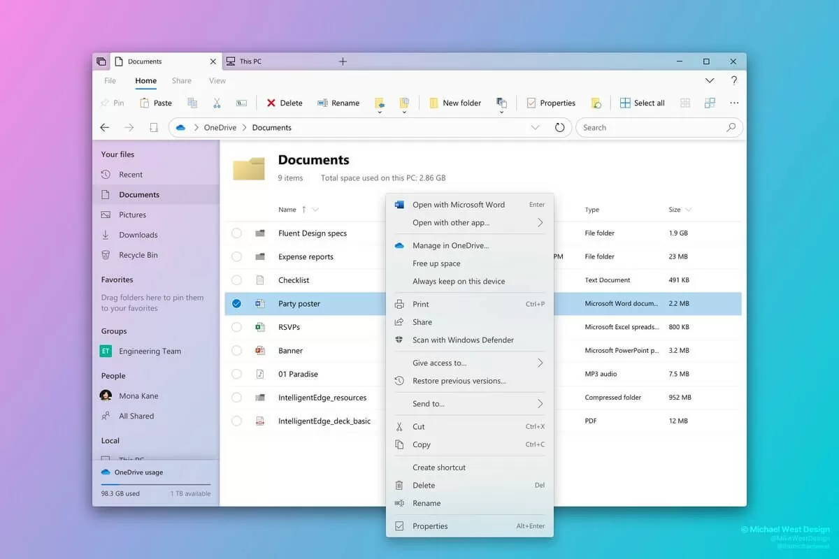
Again, despite being created in accordance with the company's Fluent Design principles, this work does not come directly from Microsoft. As such, consider it a fun bit of speculation rather than a set-in-stone design concept.

In addition to a visual rework, Microsoft may also be planning to add improved app integration into File Explorer. We don't know for sure what that means, but perhaps users will be able to access services like Outlook, OneDrive, and others from within the Explorer interface itself; without the need to open up dedicated apps.

At any rate, we won't be waiting too long to see what Microsoft has up its sleeve (if anything at all). As previously stated, this new look will supposedly release sometime in 2020, and this year's insider builds will likely give testers (and by extension, us) an even earlier glimpse of it.

We'd love to get your opinions on the concept art shown above, as well as the entire notion of a File Explorer redesign. Do you think Explorer is good as it is, or would you prefer to see it get a new look?

Permalink to story.

 
The redesign looks fine. Explorer's problem was never it's looks, it is it's basic functionality.

Why does explorer still have problems removing tags from certain .mp4 files? Why does explorer still make it hard to label and use metadata? Why does explorer stuck so much at making thumbnails? Why isn't their a media view yet for your movies and TV shows?

I could make a massive list of issues explorer has. At the end of the day, just go and buy directory opus. 100x better in every way.
 
To add to your list
Why does creating a new folder not show up unless you refresh the folder
why does the folder you renamed not show up sometimes requiring a refresh
cant be bothered writing the rest...
 
"We'd love to get your opinions on the concept art shown above, as well as the entire notion of a File Explorer redesign. Do you think Explorer is good as it is, or would you prefer to see it get a new look?"
I use Q-Dir myself. Aside from being free and super-flexible, it does one thing Microsoft does not - listen to people using it...

As for comments about that screenshot, there's clearly not enough enough white space. I suggest a minimum of 85-90% empty space and 10-15% content. Then they can be super edgy and call it "Explorer: Effusive Mellifluent Design Philosophy" and remind everyone of the good old days of 640 x 480 resolution where you could also only fit 10 items on screen at once...
 
Last edited:
I use Q-Dir myself. Aside from being free and super-flexible, it does one thing Microsoft does not - listen to people using it...

As for comments about that screenshot, there's clearly not enough enough white space. I suggest a minimum of 85-90% empty space and 10-15% content. Then they can be super edgy and call it "Explorer: Effusive Mellifluent Design Philosophy" and remind everyone of the good old days of 640 x 480 resolution where you could also only fit 10 items on screen at once...

Agreed, my main problem with this mock redesign is the ridiculous amount of white space. Especially because you'll get less files and folders listed on a single screen without having to use scrolling. I sure hope Microsoft doesn't go this route, or if they do, at least give Explorer a setting to scale down the right pane elements. I've already hated the implementation of this "fluent design" in Outlook. Too much white space is always bad, but on a file manager program it's particularly atrocious and disfunctional.

As for free Windows Explorer alternatives, my favorite is Explorer++
https://explorerplusplus.com/

Seems like I might be using it full time sometime in the future.
 
Last edited by a moderator:
I'm liking the tabs. I use TinyTabs on my ASUS Transformer Book and StarDock's Groupy on my desktop. But one of the things I've longed to have on Winfows/File Explorer is native tabs much in the way OS X's Finder (yes, I use macOS as well).

Although both tab utilities I use for Windows work well enough, they sometimes get buggy. I tend to have a few Explorer tabs open. But having it natively part of the program is a much welcomed change.
 
The only thing they could do that would improve it would be to make it like File Commander so you could have two drives showing, side by side. Other than that it's fine and all they will end up doing is over complicating it .....
 
The dark theme in the folder was all I needed. Please stop it ms.

I feverishly dream sometimes of direct x being open source so as a gamer I'd never have to deal with a ms product again.
 
I don't have time to list my criticisms of Explorer! QDir is good for free. One good thing is that unlike explorer, the tree refreshes as you navigate in the file pane. In explorer it simply doesn't link back. It's a pain! Also Microsoft, please make it customisable. Allow your default clutter to be removed so the file manager can be configured as the user wants!
 
To add to your list
Why does creating a new folder not show up unless you refresh the folder
why does the folder you renamed not show up sometimes requiring a refresh
cant be bothered writing the rest...
Ive never heard of this problem and ive been using windows since W95. Interesting. Might be something wrong with your install?

Its an intermittent issue that has been around since at least the XP days, and yes, it sometimes shows up on one Windows install and not another. Some people say its connected to drive mappings but I've never researched it much.
 
This is also a good one, but not as configurable.

Yeah it's not the Explorer alternative with most options or features, but of all I've tested Explorer++ is the one most similar to the classic Windows Explorer from Windows 2000 in look, feel and functionality, and that's all I ask for. It's also extremely lightweight.

Its an intermittent issue that has been around since at least the XP days, and yes, it sometimes shows up on one Windows install and not another. Some people say its connected to drive mappings but I've never researched it much.

For me Windows Explorer has always been like this (not refreshing folder and file changes in real time) since the Windows 95 days... I've grown so used to it that nowadays I actually prefer this way, only refreshing the listing when I hit F5.
 
I never had major issues with Explorer. I can only remember thumbnails being incredibly slow to load on .exe files in W8 and W10, small things like that. I wouldn't mind this redesign though as it looks usable.

Sometimes it seems as if their software is made in a shed by someone in their spare time. They should focus on making existing features stable and polished, that is something that Apple has, or at least, used to. Then they wouldn't have to redesign anything.
 
I remember how much I hated the change of opening my pc and getting to the recent files rather than MY PC, and the thing was that I hated it because it was not how I used to work with it rather than how useful it is, I kept changing it back to default into my drives.

Today, I can't see why I liked going to the drives where I can't resume anything of what I was doing, and can't see myself heading back. And I think it's like this with everything that changes, we only focus on the bad part of the change rather than how it could be beneficial.

We need to keep an open mind about change in general and start criticizing once there is something to actually criticize about.
 
This fluent sh-t in every programm comes with very limited adjustment possibilities...
Allredy hate it...
Worst exsample is Outlook without manualy editable settings
 
Well, let's see if they can botch SharePoint integration even further.

(This comment to appear after a prolonged synchronization...if you're lucky.)
 
I remember how much I hated the change of opening my pc and getting to the recent files rather than MY PC, and the thing was that I hated it because it was not how I used to work with it rather than how useful it is, I kept changing it back to default into my drives.

Today, I can't see why I liked going to the drives where I can't resume anything of what I was doing, and can't see myself heading back. And I think it's like this with everything that changes, we only focus on the bad part of the change rather than how it could be beneficial.

We need to keep an open mind about change in general and start criticizing once there is something to actually criticize about.

The problem is that this is extremely dependent on what kind of tasks and activities one does on their PC. What works for you, might not work for someone else. For me, recent files has very little use, and starting with a view of drive letters is much more useful. Luckily for you, your way of using Explorer is the same one Microsoft might have deemed the most common or "proper", because God help you if it isn't.
Thankfully there are ways to customize this behavior through registry settings, though in an ideal world Microsoft would allow users to customize this through a setting in the folder options panel. Since it's already possible to do through registry, shouldn't take more than a week for an unpaid intern to implement an interface setting. Computing used to be all about customization, but sadly Microsoft is going the Apple way and seems to want to alienate power users since Windows 8.
 
I miss File Explorer from Windows 2000 and Windows XP days. Sure there a few new features I like now, particularly the dark mode but they removed some advanced functionality from the newer versions. As long as they don't remove any functionality and it is reliable, then a few visual design tweaks are ok. I personally still hate the ribbon interface though and find it inefficient.
 
The problem is that this is extremely dependent on what kind of tasks and activities one does on their PC. What works for you, might not work for someone else.
I'm a 100% with you up to this point.
For me, recent files has very little use, and starting with a view of drive letters is much more useful. Luckily for you, your way of using Explorer is the same one Microsoft might have deemed the most common or "proper", because God help you if it isn't.
This is the thing that doesn't make sense, the drives are still seen up front and centre, and if you actually want to have them on top, or any other folder, you simply leave it as a shortcut or you click on the drive below the files. So yes, it's all depending on the use, but people sometimes makes all kinds of fuzz for a change because we keep on focusing on what we don't like about it, rather than working with it (As shortcuts for example).
 
For me I wish they would complete the redesign they already have. Things like settings where you start in one UI then drop back to old control panel elements when you dig down too far. Context menus with different themes. etc It can be very jarring. I appreciate that the OS is huge and to do it all would be nearly impossible, but at times the new UI is paper-thin.
 
Amazingly stupid, but very characteristic of MS. Stop changing stuff that works and moving it around. Tired of having to re-learn and retrain people how to use simple crap. It's taken years for them to remember it, only to have MS go mess it up again for no good reason.
 
I miss File Explorer from Windows 2000 and Windows XP days. Sure there a few new features I like now, particularly the dark mode but they removed some advanced functionality from the newer versions. As long as they don't remove any functionality and it is reliable, then a few visual design tweaks are ok. I personally still hate the ribbon interface though and find it inefficient.

I don't mind the ribbon, but then I only use about 4 buttons on it, EVER.
 
Back