Mozilla asks public's opinion on potential new Firefox logos

midian182

Posts: 9,763   +121
Staff member
In brief: It’s not even been a year since Mozilla launched a new icon for Firefox Quantum that was “less about fur and more about a being made of flame.” But the company is once again redesigning the Firefox brand, and this time it's asking members of the public for their opinions.

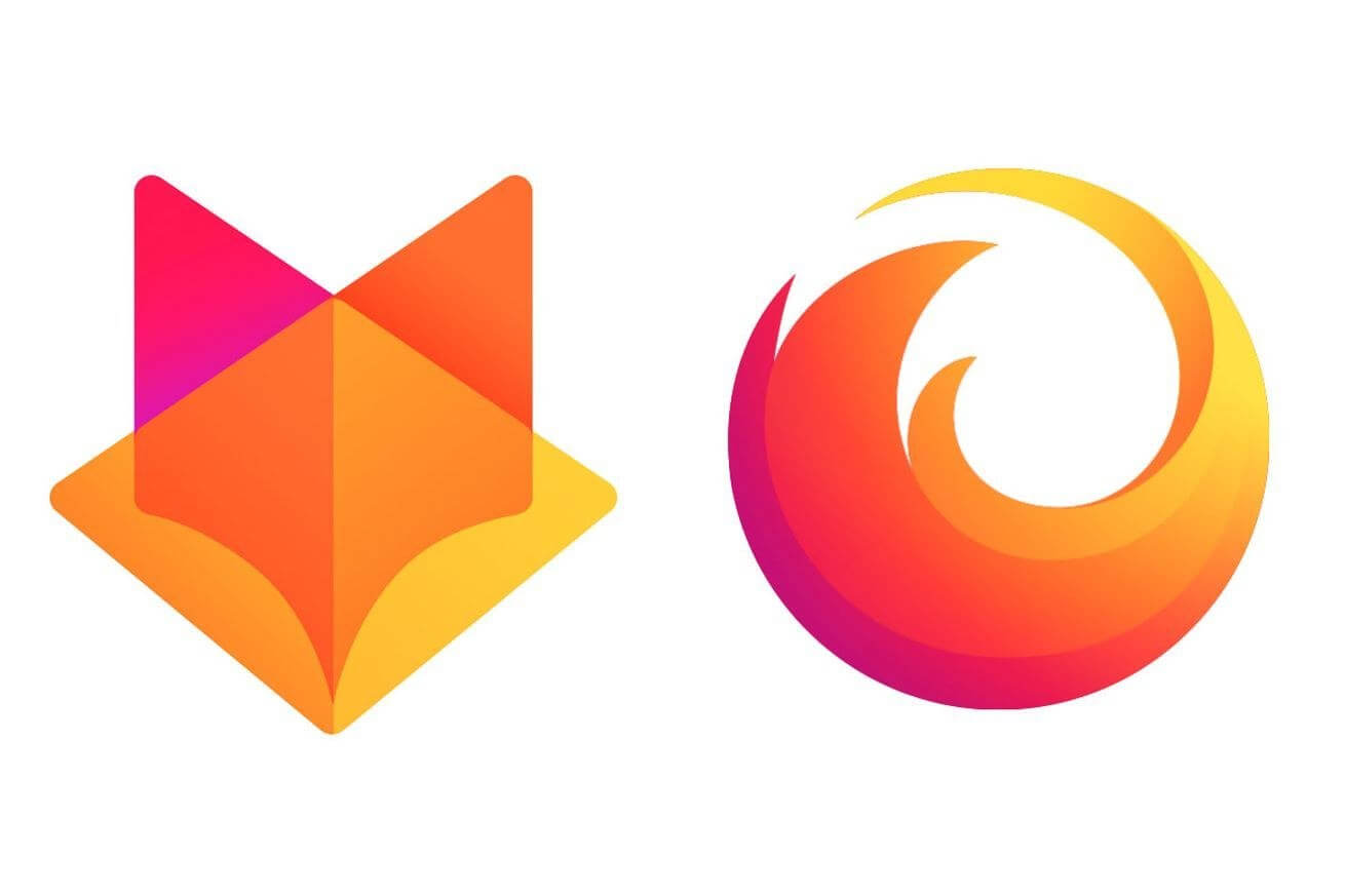
Mozilla is looking to design an entire family of icons that encompass not just the famous Firefox browser, but also its other products, “from easy screen-shotting and file sharing to innovative ways to access the internet using voice and virtual reality.” The company says the fox with the flaming tail “doesn’t offer enough design tools to represent this entire product family.”

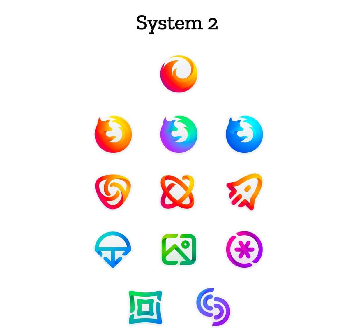
Mozilla has come up with two “design system approaches.” Both feature a “master brand” image at the top that represents the entire Firefox brand, along with options for its three general-purpose browsers (Stable, Nightly, and Developer), singularly focused browsers such as Rocket and Reality, and icons for its new apps and services, though these may change.

The company stresses that it is not crowdsourcing its new designs or asking people to vote or come up with their own submissions. It is simply requesting feedback on the icons in their current state.

Mozilla will be using certain criteria to evaluate the two sets of designs, including whether they feel like Firefox and if they’re visually cohesive.

The icons aren’t final and will undergo refinement, or change entirely, before launch. After taking into account the user feedback, the final system will be rolled out in the next few months.

"With your input, we’ll have a final system that will make a Firefox product recognizable out in the world even if a fox is nowhere in sight," Mozilla said.

Permalink to story.

 
Hard to believe that anyone out there really thinks a logo is important. It is the product that makes the impact, not the logo ..... except for those that simply arn't capable of understanding the concept ......
 
Current logo is good .. not sure why they keep changing logos..

It's better to be associated with a fixed logo, that marks the symbol of stability and longevity.

The Coca-Cola font has been the same for many, many years. It stands for something people are accustomed to.
 
Hard to believe that anyone out there really thinks a logo is important. It is the product that makes the impact, not the logo ..... except for those that simply arn't capable of understanding the concept ......

If you truly believe this to be true, can you give me your explanation as to why Apple is such a huge company? Sure, logo is only one part of brand, but their brand is 90% of who they are and what they do.
 
As long as it sticks to the orange/yellow colors and remains essentially the same logo style. But really the currently logo is fine. Honestly they should just leave it as is. Firefox Quantum is a great product...the logo is irrelevant.
 
Current logo is good .. not sure why they keep changing logos..

It's better to be associated with a fixed logo, that marks the symbol of stability and longevity.

The Coca-Cola font has been the same for many, many years. It stands for something people are accustomed to.
The font hasn't changed much over the years, but if you look closely you'll spot small differences.
As for their logo, they had a lot of changes around that font.

On a side-note, they made their own font recently. Go check out TCCC Unity.
 
System1 looks too much like a GitLab ripoff. Edit: could have checked there is already a zillion comments on the original page mentioning the same :)
 
Last edited:
Hard to believe that anyone out there really thinks a logo is important. It is the product that makes the impact, not the logo ..... except for those that simply arn't capable of understanding the concept ......

If you truly believe this to be true, can you give me your explanation as to why Apple is such a huge company? Sure, logo is only one part of brand, but their brand is 90% of who they are and what they do.

Apple had the same logo when Jobs was away and they were on the verge of bankruptcy. Those iPods and iPhones saved them, not their famous logo.
 
Hard to believe that anyone out there really thinks a logo is important. It is the product that makes the impact, not the logo ..... except for those that simply arn't capable of understanding the concept ......
If you truly believe this to be true, can you give me your explanation as to why Apple is such a huge company? Sure, logo is only one part of brand, but their brand is 90% of who they are and what they do.
I could be mistaken. But it almost sounds as if you are implying, Apple's logo made them the company they are today.
 
I could be mistaken. But it almost sounds as if you are implying, Apple's logo made them the company they are today.

The Temptation and Fall of Man in Genesis Chapter 3;

https://www.bible.com/bible/114/GEN.3.nkjv

It may very well be the case that Apple's logo has propelled them to their position in the industry.

The logo is taken from the bible, and it connotes the acquisition of knowledge by man. And since the story finds a place in the psyches of both the devout and atheist alike, but with entirely different meanings, I guess one might say, it's the "one size fits all", of modern corporate identities...:eek:

As far as the sh!t Mozilla is proposing as its new logo, I say "scrap it all".

The "Firefox" is the colloquial name for the red panda, Ailurus fulgens. In its own family, genus , and species, it is unique in the animal kingdom, the same as Mozilla is purporting Firefox browser to be. SO, IMHO, they would do well to keep the red panda intact as their logo
 
Last edited:
I could be mistaken. But it almost sounds as if you are implying, Apple's logo made them the company they are today.
You are mistaken as to any implication, I'm outright saying that their brand is 90% of who they are and what they do, and their logo is a large part of that, hence writing the words that I did.
 
On the whole I prefer System 1 although I would change the 3 firefox icons for the ones in system 2 which are so much cleaner and nicer IMO.
 
Back