What just happened? Finnish telecoms giant Nokia has announced that the company is rebranding and, for the first time in almost six decades, changing its logo. The move is part of a strategy to disassociate Nokia from smartphones, which it hasn't made in around ten years.
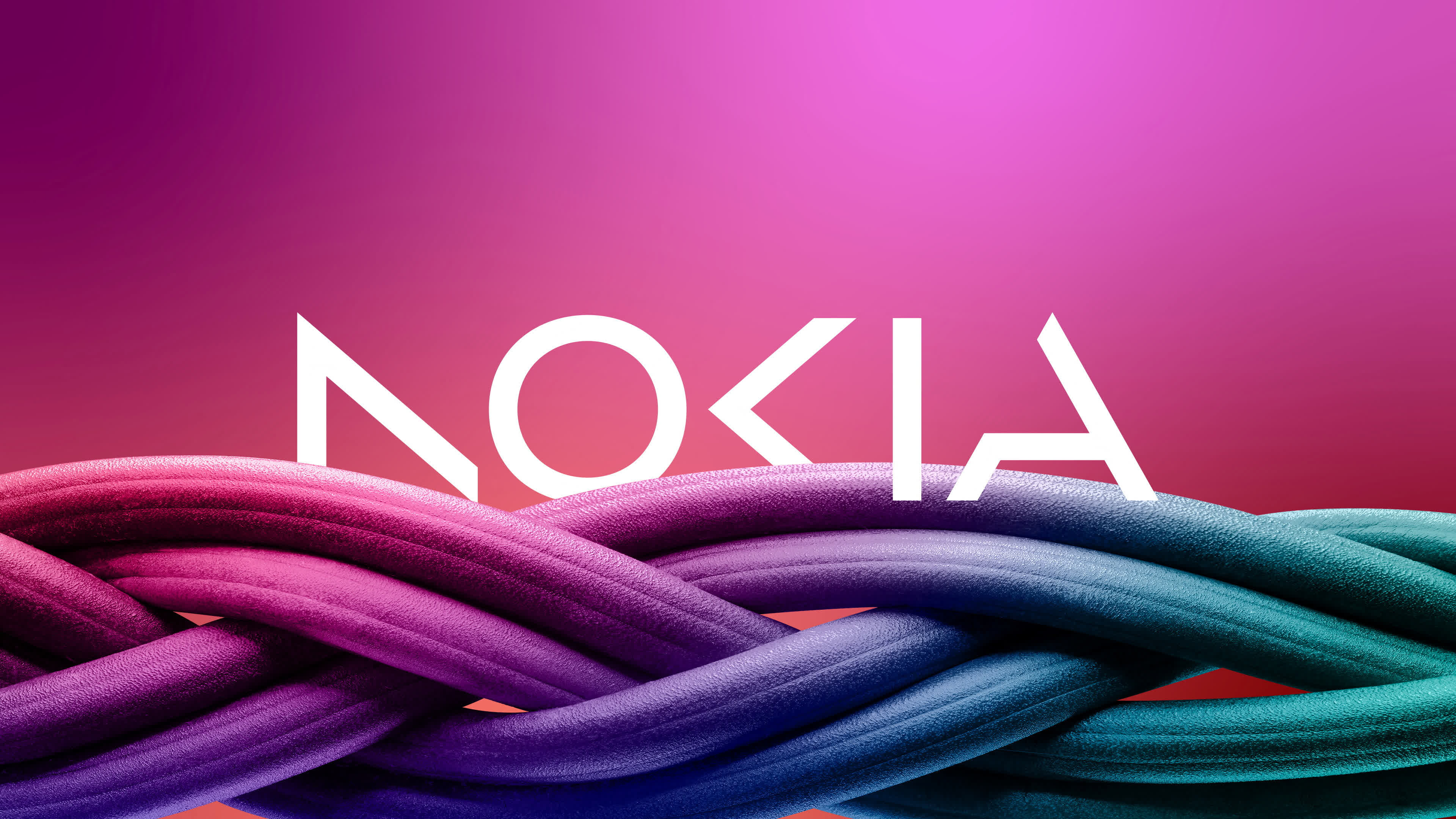
On the eve of Barcelona's Mobile World Congress, Nokia announced a new corporate logo that is made up of five different shapes to form the company's name. The famous blue-colored lettering of old has been replaced in favor of a range of colors that change depending on the use.
Chief Executive Pekka Lundmark told Reuters, "There was the association to smartphones and nowadays we are a business technology company."
Nokia hasn't made smartphones since the Nokia Lumia 1020 in 2013, the year before Microsoft bought its mobile phone business - and we know how that turned out. Microsoft sold its Nokia-branded feature phone business to HMD Global in 2016.
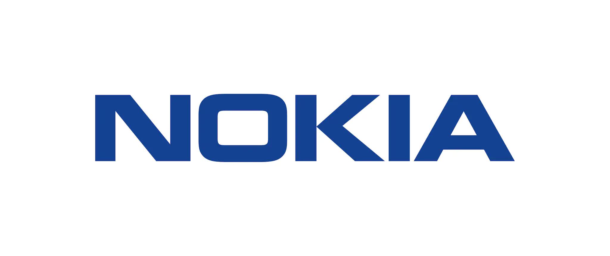
The old Nokia logo. Is the new version better or worse?
Because of a long-term licensing agreement between the companies, phones carrying the Nokia name manufactured by HMD Global have been around since 2017 and are still being released today. The Nokia G22, a phone designed to be easily repairable thanks to repair guides and tools produced alongside iFixit, was announced yesterday. The battery can be swapped out in five minutes, and replacing the screen is supposedly possible in about 20 minutes.
"In most people's minds, we are still a successful mobile phone brand, but this is not what Nokia is about," Lundmark told Bloomberg. The CEO said that Nokia wants to launch a new brand focused on networks and industrial digitalization, "which is completely different from the legacy mobile phones."
Nokia hopes to increase its market share when it comes to serving wireless service providers with network equipment, something that should be easier now that Huawei is prohibited from selling its 5G networking gear to many countries. But Nokia's main focus will be selling equipment to private companies, an area that made up 8% of its revenue last year, or around 2 billion euros (roughly $2.11 billion). Lundmark said Nokia's aim is to take that figure into double digits as quickly as possible.
https://www.techspot.com/news/97743-nokia-changes-logo-first-time-almost-60-years.html
