Twitter is redesigning its redesign after users complain of headaches and eyestrain

midian182

Posts: 9,734   +121
Staff member
Facepalm: Imagine a scenario in which you introduce a revamped design for your company's product, something that millions use, only to find it's giving customers headaches. That's the situation Twitter finds itself in and must now redesign its redesign.

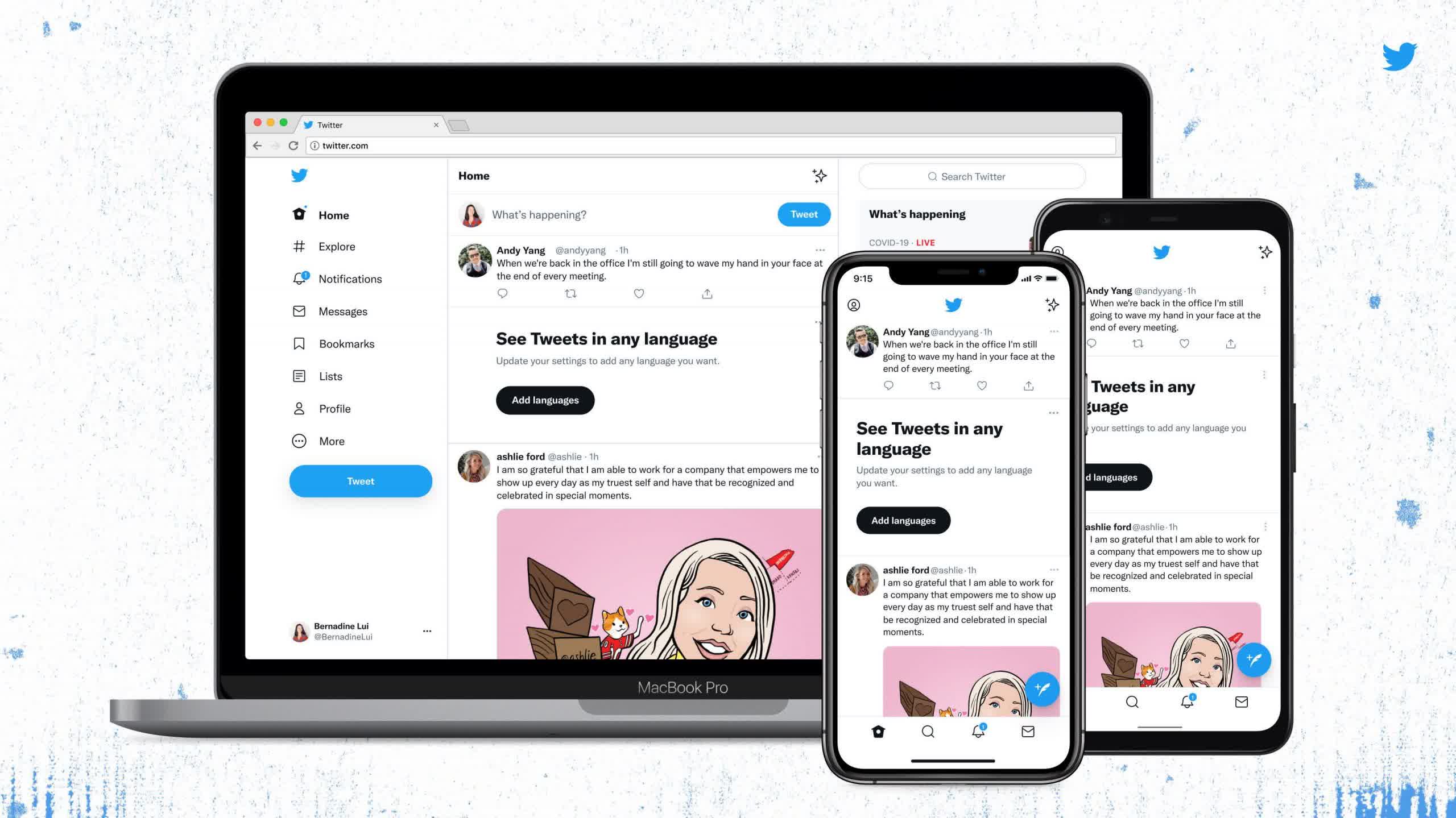
Twitter rolled out its updated app and website last week, introducing "higher color contrast of buttons, links, focus [and] easier reading with left-aligned text and more space between text." It also added a custom-designed font called Chirp.

Twitter admitted that the change "might feel weird at first" but would allow easier reading and improve visual clutter. It didn't count on the redesign causing eye strain, headaches, and migraines among many users.

It seems the new look has been especially problematic for those with accessibility needs, despite Twitter claiming the redesign made the platform "more accessible." While the high contrast design might help those with low vision or color-blindness, it is causing problems for others. The inability to resize the new font in the Twitter apps has also been an issue.

"These new features have made Twitter inaccessible for people with astigmatism and dyslexia (the new font), and color-contrast and photosensitive migraineurs (the new color scheme)," one user wrote.

According to TechCrunch, "Twitter far exceeds the minimum contrast standards set by the Web Content Accessibility Guidelines (WCAG), which provides recommendations for making websites accessible to disabled people."

Twitter has acknowledged the complaints and is now making contrast changes, so the new look is "easier on the eyes."

Twitter thanked everyone who has offered feedback on the change and asked users to continue submitting their opinions. It's also working on a fix for the Chirp font. Expect the next redesign to arrive soon.

Permalink to story.

 
Hey I have an even better idea than "redesigning the redesign". It's very cost effective as it cuts down a ton of money on developing and testing and already has a ton of user approval.

Here's the plan: *REVERT BACK TO THE WAY IT WAS BEFORE THE BOTCHED UPDATE* Literally nothing was wrong so the solution is not to redesign the redesign only to later having to redesign the redesign of the redesign but even that continues to infuriate customers who are screaming at you "JUST PUT IT BACK THE WAY IT WAS"


Sometimes a redesign comes with changes made on the backend, so it could be that they changed things on the backend (code) and need certain aspects of the program to function a little differently.....but, most likely they're just taking a page out of MicroSoft or Steam's book.

Change everything so it functions and looks differently, then claim it's what people wanted and then not fix it! By "not fix it" doesn't mean they won't be trying to redesign things and make changes, I mean that they won't actually fix anything back to how it was.

Steam's updated UI from about 2 years back still has problems they haven't fixed and when they say the fixed problems, all the did was create more and still haven't resolved all the issues.

MS, they just redesign things to try and match the horrific layout of Mac. Hey, look everybody! Windows 11 looks sleeker! We changed how the taskbar looks! What? No, we're not trying to look like the iOS....what...no.
We rounded the corners of windows! Yeah! It's so awesome! Everyone was asking for this change so we finally did it!
Also, you won't see that pesky Blue Screen of Death anymore, oh no siree Bob. You might see the screen come up in different colors such as green or black because people fear the blue color of the screen and the associate it with being bad!


These companies change things because they want to keep up with the next flashy thing or because they have absolutely nothing new to offer in terms of how their software/site functions so they change the one thing they can still impact - the UI.

I remember years ago when the look of Facebook was the thing to copy. A lot of sites started copying what Facebook was doing with layouts and everything looked like absolute $hit because that's what Facebook is, $hitty.
 
I'm not a big fan of Twitter, but I barely noticed anything changed on there... I can kinda tell the font looks different, but that's about it lol. Does anyone have before and after pictures?
 
Back