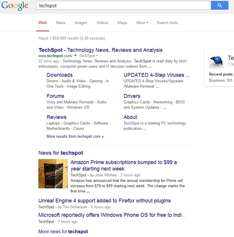
If you noticed that something looked a little "off" on Google recently but just couldn't place your finger on it, here's your answer. The search giant quietly rolled out a subtle redesign yesterday that does away with the familiar underline, among other things.
In addition to ditching underlined hyperlinks, a longtime staple of the Internet, Google has also increased the font size of search result titles by two points and evened out all of the line heights. In a Google+ post on the matter, lead search designer Jon Wiley said the changes improve readability and create an overall cleaner look.

Wiley also took the opportunity to point out the fact that Google also brought over their new ad labels from mobile, a move that aims to make the multi-device experience more consistent. This, in turn, will make it easier for them to develop and ship improvements across the board.
Google is one of the first major search engines to do away with underlined hyperlinks as Yahoo and Bing still use them. Upstart DuckDuckGo, meanwhile, does not use underlined links and their search results are even cleaner than Google's new design through the use of truncated URLs.
The changes aren't really new for Google, however, as they've been pushing similar tweaks to mobile devices since last year.
I'm not entirely sold on it just yet but I'm not big on change, either. What do you think about the new layout? Sound off in the comments section below!