Forward-looking: With the advent of mobile payment solutions and cryptocurrencies, bank cards may not be around too much longer. In the interim, however, we might as well improve them to better fit how they are used in modern society.
Most people don't give a whole lot of thought to their bank card aside from perhaps spicing things up with a novelty theme like their favorite sports team or a charity they support. Indeed, credit and debit cards haven't changed a whole lot since their inception decades ago.
A recent feature addition, however, now has some believing a total redesign is in order and looking at the evidence, it's hard to argue against it at this point.
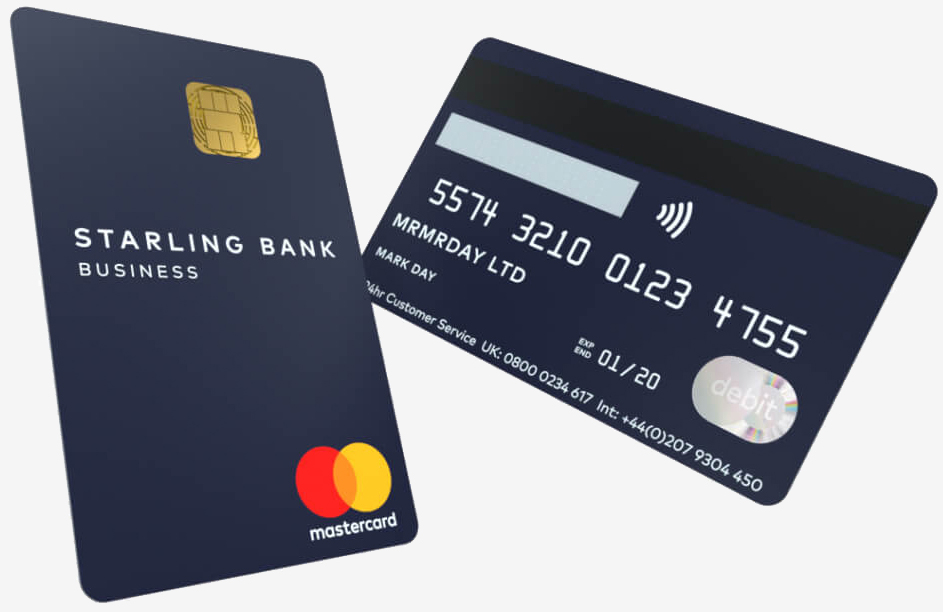
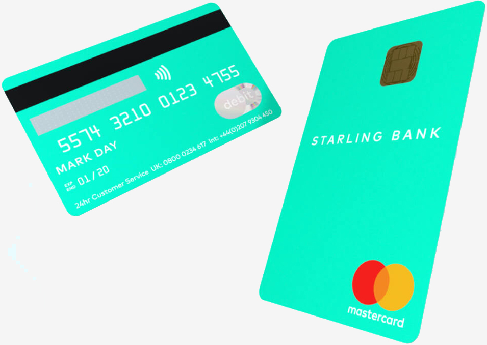
The UK's Starling Bank recently introduced vertical bank cards. It sounds like a design gimmick with no merit but hear me out.

As Starling's art director Mark Day explains, traditional bank cards were designed in landscape because of the way old card machines worked. They are embossed with raised numbers so they could be printed on sales vouchers. The problem is that we no longer use those old credit card imprinters.
Today, when you hand over your card to a cashier, odds are, you do so while holding it in portrait orientation. The same goes for when you insert your card into an ATM machine or tap it for a contactless payment. Swiping a card vertically along its magnetic strip is still somewhat common but with chip-enabled cards, that method is also going away.

When you think about it, Day says, a landscape card is just a solution to a "problem" that no longer exists.
In designing their new card, Starling Bank looked at how people use cards today and the answer was obvious - in portrait orientation. The new card was designed accordingly and is said to feel like a natural extension of their mobile app (they are a mobile-only bank, after all). All of the relevant details have been moved to the back of the card, leaving a clean and clutter-free look up front. They've also ditched the bumpy embossing as there's no need for it these days.

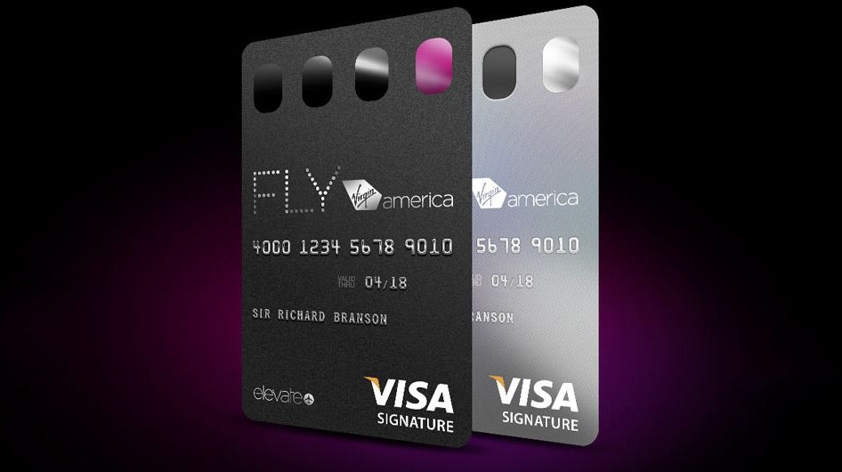
Starling isn't the first to design a vertical bank card but it's perhaps the first to draw this much attention to it. Virgin America, for example, has a vertical Visa credit card although it doesn't look nearly as good as Starling's option as it crams all of the user details on the front. GM also has a Capital One MasterCard but again, it looks cluttered.
I'm typically resistant to changes like this (I'm still not quite on board with the whole vertical photo / video movement) but in this case, I welcome the design shift. It's practical for how we use bank cards today, it eliminates unnecessary embossed numbers (their paint usually rubs off within a few months of use) and it's more aesthetically pleasing (Starling's example, anyway).
What do you think of Starling's new card design? Would you trade in your current plastic for a vertical version or do you prefer to stick with the tried-and-true landscape orientation?