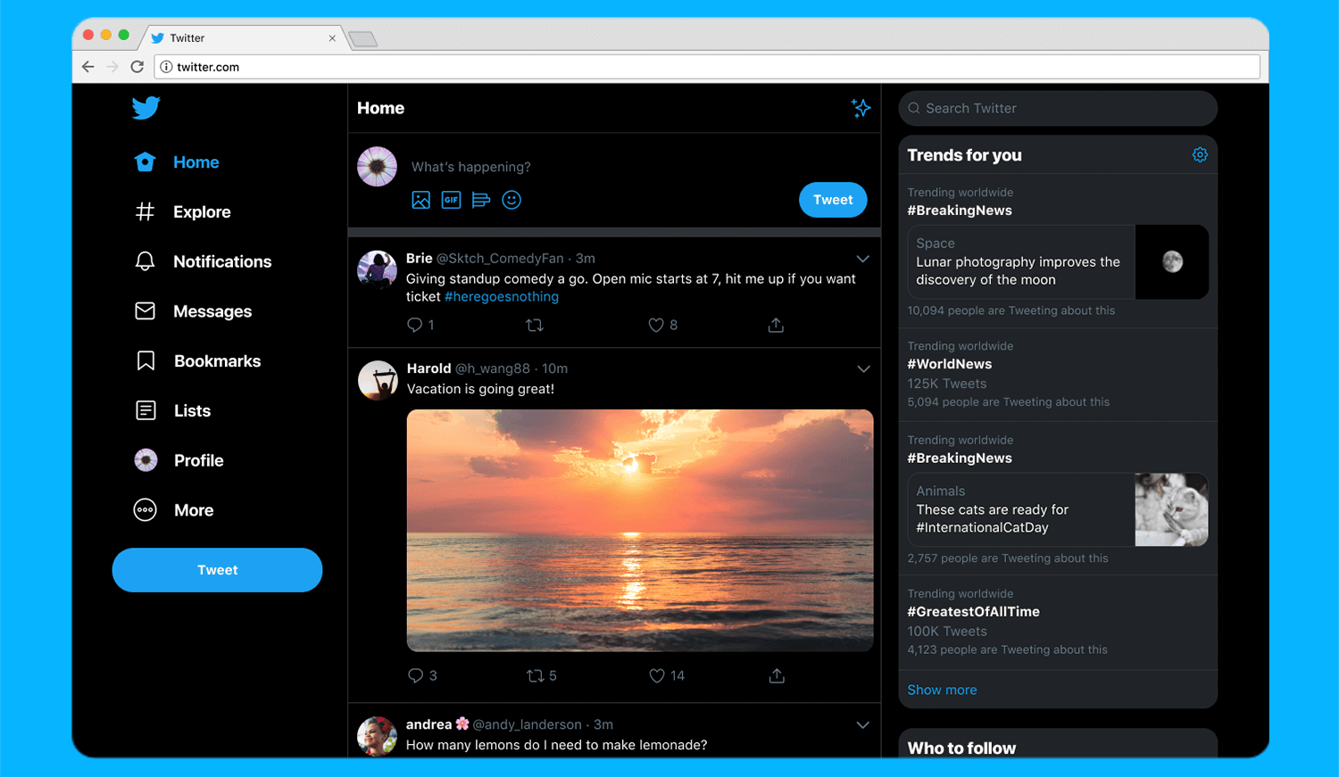
The big picture: Twitter.com has been given a major overhaul that's supposed to make the website faster and easier to navigate. On the front end, there is an improved layout with a left sidebar, new themes, and a new dark mode. On the back end, everything's been rebuilt from the ground up to allow Twitter to bring new features to everyone at the same time and simplify development.
Twitter has been having a problem with user growth, mostly due to its slow progress on reducing abuse on its platform, but also because it has a history of making bad design decisions that make it harder to navigate and communicate, such as fiddling with its reverse-chronological feed. Quality of life improvements such as rich content in retweets only recently made an appearance, presumably because Twitter has been working on something bigger.
For the past few months, devoted users of the microblogging platform have been testing a significant redesign of Twitter.com, and today the company has started rolling it out to everyone else. There's no edit feature in sight, but this is the biggest change to the look and feel of the website in almost seven years, making it much more consistent with the experience found on mobile devices.
The most noticeable visual changes are in how the whole website is organized, with a left-hand sidebar that gives you quick shortcuts to all the important Twitter sections like Explore, Notifications, Direct Messages, Lists, and more. There's also a new dark mode if you're into that, and a number of new themes to personalize your Twitter.
Woah, what's this? A shiny new https://t.co/q4wnE46fGs for desktop? Yup. IT'S HERE. pic.twitter.com/8y4TMzqBGa
--- Twitter (@Twitter) July 15, 2019
Bookmarks on the desktop are now a thing, which will no doubt come as a welcome surprise to many users. The Moments feature is now hidden in the More section to make way for the Explore tab with its more localized video content and trends.
Where there used to be a lot of friction to switch between different accounts, now the website allows you to do that directly from the side navigation. Direct Messages are also easier to follow up on, with conversations now having their own dedicated, dual-pane window. The sparkle button is also present, for those of you who want chronologically-ordered tweets.
What's even more important is that Twitter has rebuilt the backend from scratch in an effort to reduce hiccups caused by poor architectural decisions made in the past, and poured everything into one single codebase across mobile and desktop – a progressive web app.
This allows Twitter to apply a "write once, run everywhere" philosophy to simplify the development of new features, and it also means users like you and me can get these updates at the same time. Features like Data Saver can now be activated on any device, and tablet users who connect a keyboard will be able to use keyboard shortcuts.
It's worth noting that once you get the new Twitter experience, there is no way to roll back to the old one. The good news is that since it's a progressive web app, the company can make quick retouches where necessary.
