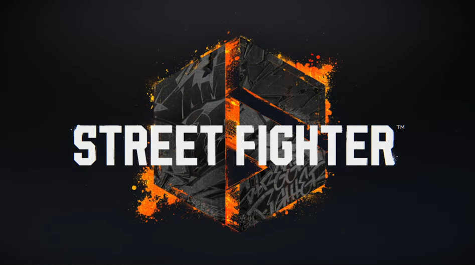
What just happened? One of the many reveals at Sony's State of Play event was a new Street Fighter 6 trailer. Not only did it show some interesting gameplay elements, including what appears to be an open world that players can wander around in searching for fights, but the old logo, which looked suspiciously like an edited stock image, has now changed into something a lot more pleasing to the eye.
It was back in February when Street Fighter 6 was first announced. But while it brought plenty of excitement among fans of the long-running fighting series, the reveal also showed what was potentially one of the worst logos of all time. The simple, black and white hexagonal shape containing the SF initials was a far cry from the previous games' combination of the Street Fighter name and roman numerals.
This is a disaster pic.twitter.com/EKpZvU0GH1
--- Danny Sweeney, Elden Lord 🌙 ✨ (@Dann_Sw) February 21, 2022
What was even more shocking about the old logo is it looked almost identical to an $80 stock logo on Adobe's stock images site (below right), albeit with some very minor changes.

It appears that Capcom listened to the criticism. The recent Street Fighter 6 trailer shows an all-new logo, and it's pretty good. The hexagonal shape remains, but this time it's a lot more stylized and has been edited to look like a number six. But the clever part is that if you spin the logo clockwise, the right side of the 6 turns into "VI," the Roman numeral for six.
Capcom wouldn't be the first company to redesign something following outcry. The original movie version of Sonic the Hedgehog had human-like teeth and legs and a large gap between his normal-sized eyes, causing revulsion among fans. It led to a much better-received redesign, and the movie went on to become one of the best and most successful based on a video game. That wasn't the end of ugly Sonic, though; he recently returned for a cameo in the new Chip 'n Dale: Rescue Rangers film.
h/t: Kotaku
