Highly anticipated: With the iPhone 17 series and iPhone Air unveiling out of the way, Apple is now ready to roll out the latest versions of its operating systems for iPhone, iPads, and Macs. iOS 26, iPadOS 26, and macOS 26 introduce a revamped UI with a translucent "Liquid Glass" look that Apple describes as the most significant visual update to its operating systems since the release of iOS 7 in 2013.
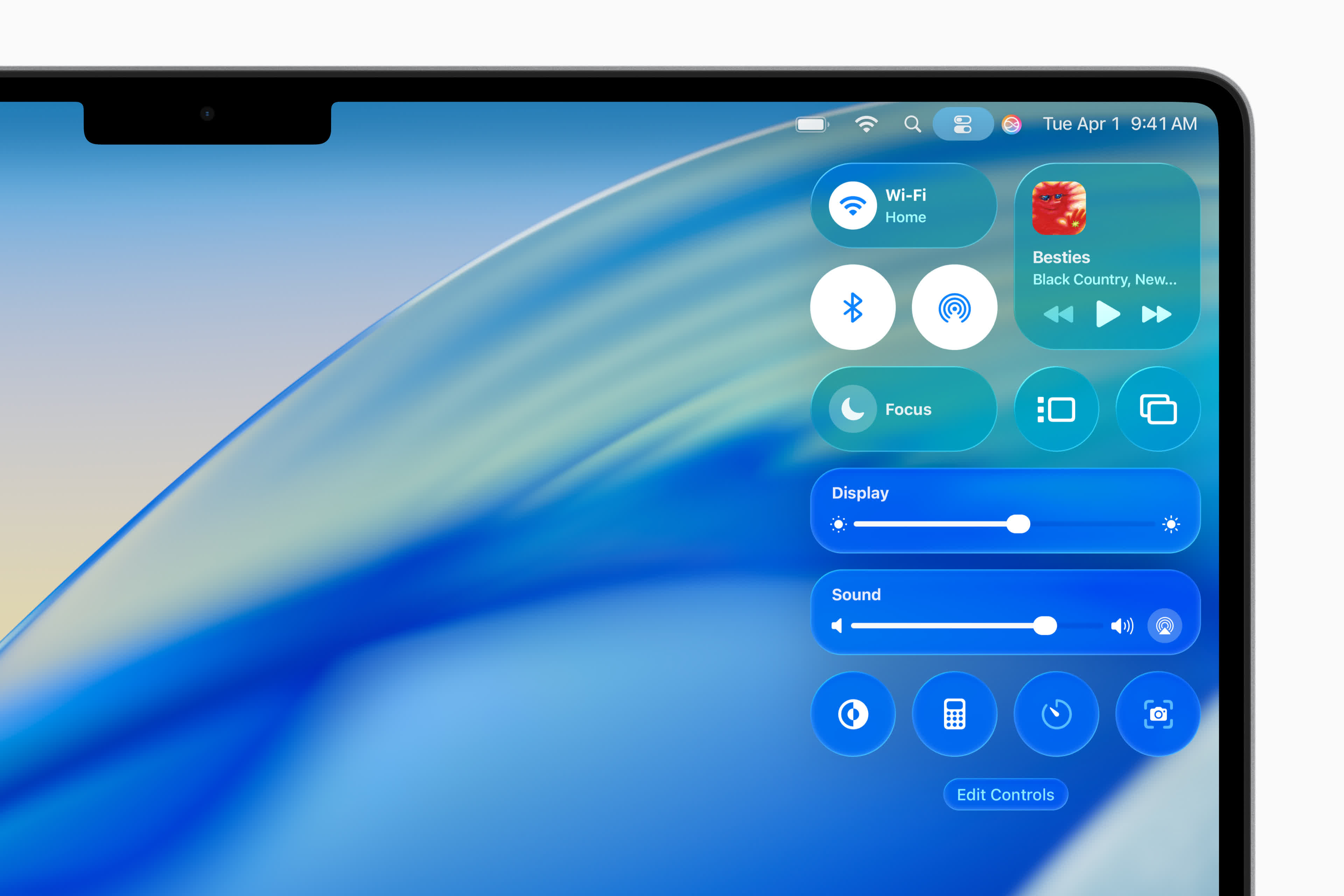
The Liquid Glass design was first previewed during Apple's WWDC event earlier this year. At the time, Apple said the updated interface makes apps more visually appealing and the overall system easier to navigate. According to the company, the translucent effect "reflects and refracts its surroundings" and helps users focus more on content.
The new design is available in both Apple and third-party apps. Apple says the UI combines the "optical qualities of glass with a fluidity only Apple can achieve." Apple added that the new design language lays the foundation for new experiences in the future.
The update also introduces several new Apple Intelligence features for iPhone, iPad, Mac, Apple Watch, and Apple Vision Pro. One of the most notable additions in iOS 26 is Live Translation in Messages, which allows users to seamlessly communicate with others despite language barriers.
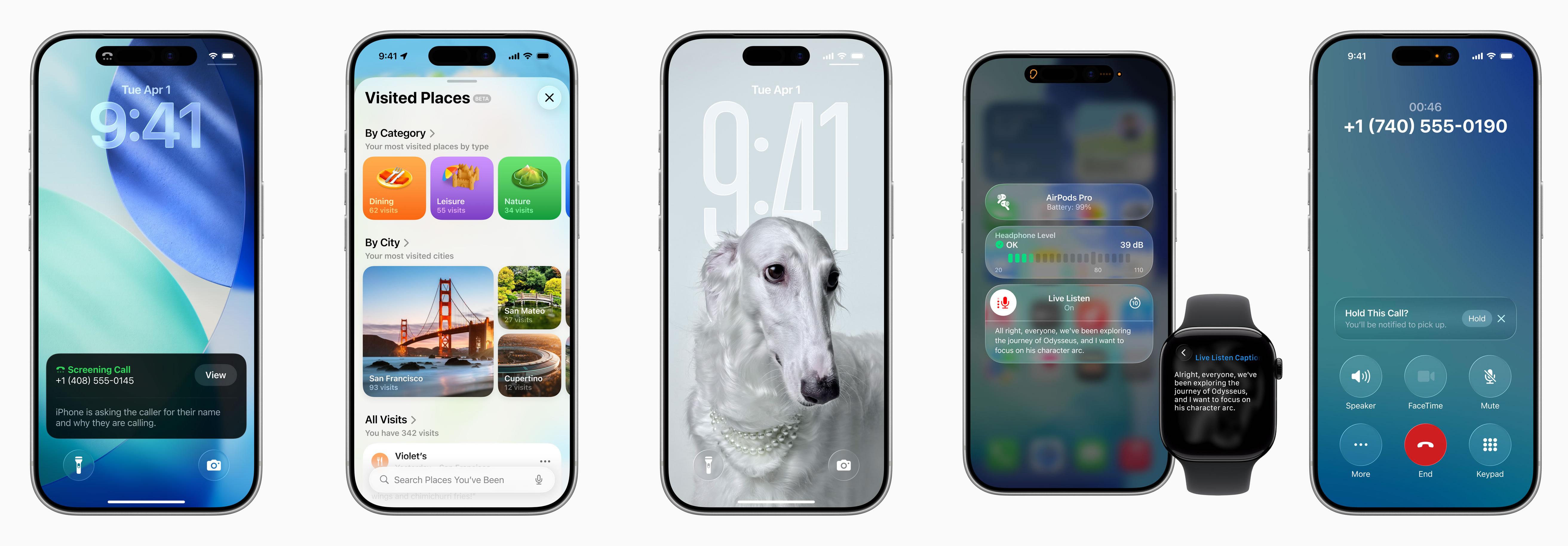
Apple has also enhanced Visual Intelligence, allowing users to ask ChatGPT to identify the contents of images, either stored on the device or found on the web. The Workout Buddy app now uses Intelligence to deliver personalized spoken motivation during workouts, improving the fitness experience on Apple Watch, iPhone, and AirPods.
iPadOS 26 adds a new menu bar that provides quick access to app commands by swiping down from the top of the screen or moving the cursor to the top. Apple is also bringing the Preview app to iPad, giving users the ability to view and edit PDFs and other common file formats without the need for third-party apps.
macOS Tahoe incorporates the same Liquid Glass design language and introduces new features for Spotlight and Shortcuts. Spotlight now offers enhanced browsing views for files and apps, improved search, and quick actions such as sending emails or creating events using keyboard shortcuts. Shortcuts gains Intelligent Actions and the ability to automate complex tasks with help from Apple Intelligence.
Other notable updates include an improved Control Center, a transparent menu bar, new color options for folders, app icons, and widgets, and more. The Phone app now supports Call Screening and Hold Assist, while Live Activities from iPhone can now also appear directly on the Mac.
Apple iOS 26, macOS 26, and iPadOS 26 are now available with new Liquid Glass UI
