Google planning 'radical' change for Chrome user interface

Jos

Posts: 3,073   +97
Staff

Google developers behind the popular Chrome browser are reportedly looking at ways to simplify even more its characteristically straightforward user interface. According to a report on ConceivablyTech, among the options on the table is the elimination of the URL bar, which itself would come from offering four different types of navigation: The classic navigation version, compact navigation, sidetab navigation as well as a touchscreen version.

Google is reportedly interested in developing all four versions, but current builds of Chrome are focused on classic and compact navigation styles. The "Classic" version is what you see now, while the compact navigation mode integrates the URL bar onto each tab instead, so you'd have to first select the tab and hover the mouse on the tab for the address to show up. It might take some time getting used to but those who value screen real estate could appreciate the option.


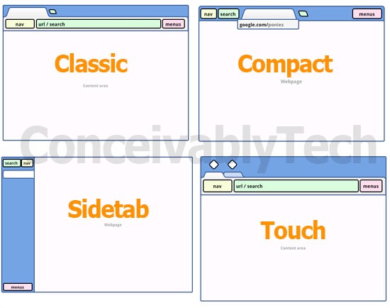
Downsides include the fact that the URLs would not always be visible, while navigation controls and menus lose context sensitivity as they are not located within the tab. It's a significant modification but if past changes are any indication, this would likely be released to the Canary build first, possibly under an option, and depending on how users respond it might extend to the beta version with all the necessary tweaks.

Another feature that Google is working on is the possibility to use multiple user profiles in parallel. This means if you have multiple Google accounts you will no longer need to sign in and out of them, but rather use them in simultaneously in different browser windows. The feature would be available via a new Profile section in the browser options and is tied to Sync as well, so it will load bookmarks, passwords and auto fill options that are tied to a specific account.

Permalink to story.

 
Compact seems to be straight ripoff of IE9 interface, hence, once again Google's mantra of 'we can copy anything' comes into play. Whereas that sidebar tabs version, I've tried to use an extension for FF allow it, but never liked it. So in essence they are copying this feature as well. So whats new by the way?
 
Archean said:
So whats new by the way?

They are adding support for things other browsers can already do. Is that copying? that's up to you, but I call it smart business practices. Also, one of the only reasons I don't like chrome is because of the UI. I might have to check this one out.
 
"but those who value screen real estate could appreciate the option."

Oh yeah, because that thin strip takes up oh so much space. /sarcasm

The classic and touch versions I agree with. The sidebar is cool I guess, but would be annoying to me. For the compact version, no thanks. Not saying I won't try it when it comes out, but from the way they describe it, no thanks.
I am glad to see the use of multiple profiles. The thing I hate now is that when I sign out of my personal gmail account to log into my school/work gmail account, it logs me out of my youtube channel. And...well, to keep it from getting confusing, i'll stop there, lol. Let's just say i'm glad for the use of multiple profiles. Linking youtube account to gmail account was one of Google's dumbest ideas. But now I drift off topic.

So far from what i've seen and read, looks like i'll still be using both chrome and firefox. Each has its things I like better than the other.
 
They should just remove the download bar at the bottom i hate it and let us stack some more bookmarts on the bookmark bar, off from that.... ball to you.
 
I'm not so sure...
Chrome is small enough for me as it is and i can only see the compact version slowing me down which is against the point of chrome in the first place.
 
Not sold on the compact layout, you save like 15 vertical pixels and give up a lot of horizontal space, which isn't so good if you have a lot of tabs open.

The sidetab is interesting but personally I like having 2 windows side by side so it wouldn't work.
 
My Compact Mode tends to be just hitting F11, but... ::shrugs::

(Mainly, if I want space, I'm not gonna pay attention to the address bar, and if I want to see an address bar, I want to see the whole thing to know what domain, what folder, what page, and what parameters make up my URL. Not seeing the whole thing most of the time is counter productive to my own browsing habits.)

On the rare occasions I'm using a wide screen (I still use dual 1280 x 1024 LCDs in my own setup), I've often have Opera set my tabs to the side, almost always as thumbnails for easy navigation and to avoid having huge expanses of empty space on most webpages. Too, I would think this would work quite well for touch-enabled devices. Maybe Google can take a page out of Opera's book for that.
 
Cota said:
They should just remove the download bar at the bottom i hate it

What download bar at the bottom? I have no download bar on my browser, and haven't seen any others who have it on theirs. It only comes up when you download something, and it goes away if you just click the "x".
 
I have a CR 48 and the only problem I have with it is with the UI. Google should make Fullscreen mode the default..reason being is because there is a dedicated search button and a dedicated fullscreen mode button. If the entire URL/Tab bar was "hidden" they should make you either hover the cursor to the top of the screen to see it when you need it, or you have plenty of other chances to see the bar with the 2 dedicated buttons I mentioned...
 
Back