Google reverts back to previous version of Chrome's bookmark manager after public outcry

Justin Kahn

Posts: 752   +6

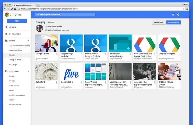
You are probably trying to forget when Google updated bookmarks in Chrome at the end of last year. Well don’t worry, the company has quietly changed gears and switched back to the old one. Last year’s version, while seemingly an improvement across the board with a “nicer” layout, images, a handy search and more, was not popular with users. After remaining quiet regarding the public’s vehement disapproval, Google has reverted to the previous version as it heads back to the drawing board.

Users felt the updated version was difficult to use, and despite its overall improved look, just wasn’t what the doctor ordered. Users preferred the slimmmed-down, lightweight approach of the previous version, as you can see from these Google Product forum responses.

Even though it didn’t get it right the first time around, the Chrome team will continue to experiment with bookmark manager options and new ways “to improve the experience” as a whole.

However, for those of you that did enjoy the new experience, Google has wrapped it up into a handy browser extension known as Bookmark Manager. For those that don’t want that new experience and can’t seem to get rid of it, you’ll just need to update your browser. Hit the “Chrome” menu or that hamburger menu on the top right corner of your browser window and select About Google Chrome. From there you can enable auto updates or manually take the step up (back?) to the previous bookmarks manger.

Permalink to story.

 
Exactly what I thought. It's a PC, use the space on the screen. Massive boxes for each bookmark and folder, not to mention how slow it was to navigate,
 
This is a pattern with alot of google things. They do certain things because they have the programming knowledge to, not because its technically the best thing to do...Like is it just me, or has the google search algorithm just gotten drastically worse the last few years?
 
Good call, it was horrible.
I wouldn't go that far. In spite of me personally liking the new Bookmark Manager there is never any better choice than allowing the end-user to choose how he wants to experience his computer. Making this new feature an optional extension was the smartest way to handle the outcry. Unlike anything Microsoft ever did with Windows 8.

Exactly what I thought. It's a PC, use the space on the screen. Massive boxes for each bookmark and folder, not to mention how slow it was to navigate,

The speed of the individual user experience probably has to do with several factors, including your internet speed, and the specs of your computer system. I don't really see the new bookmark manager as anything different from selecting "Extra large icons" in Windows 7 file explorer. There are 7 different ways to view files in a folder on Windows 7. Again, So, you bookmarked a website a long time ago and forgot what it was about, a large preview image makes good sense. If you know 99% of the websites you have bookmarked(like the back of your hand) being able to change the way the bookmarks are viewed would be preferrable.

Choice is how you make the most people happy in the end. Google did it right. Why are software companies so slow to figure this simple principle out?

Oh well, lessons learned hardest are lessons learned best.
 
It's not a big deal. I love the new look...but good move to make it an extension tho. Am sure the same people crying about the new look will add the extension. lol
 
The new bookmarks manager was not finalised yet. The default view should be list view and adding a bookmarked website should at least allow you to search all folders not those in the current directory.
 
Wow, I thought I was the only one who thought it sucked. Thank you, forum complainers! Now just get rid of the notifications icon in the system tray and we're back to normal. And grats, Google, on not being nearly as slow and stubborn as Microsoft with the Start Menu.
 
I too am glad they reverted it back. The change was not intuitive to navigate and the old system is much easy to read. Google should not forget them selves. Their minimalist approach is their calling card. Why muck it up with a fanciful bookmark managers.
 
Features are what extensions are for. They ought to make this an official extension so that only those who want it get it.
 
Wow, I thought I was the only one who thought it sucked. Thank you, forum complainers! Now just get rid of the notifications icon in the system tray and we're back to normal. And grats, Google, on not being nearly as slow and stubborn as Microsoft with the Start Menu.
The only thing funnier than this comment is the thought of who was the first two to like the comment (TheBigFatClown and myself).
 
Back