Microsoft accidentally leaks internal build of Windows 10 with redesigned Start menu

Cal Jeffrey

Posts: 4,154   +1,416
Staff member
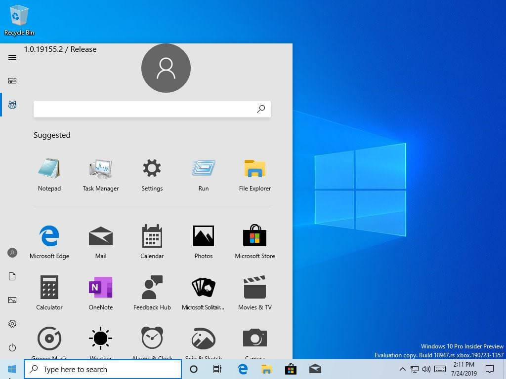
Oops: An internal version of Windows 10 may have revealed a newly designed Start menu. First noticed on Twitter, the live tiles seem to have been removed in favor of icons. It could be a very early rendition of what users will see in Windows Lite.

Microsoft unintentionally pushed an internal-only version of Windows 10 to Insider testers this morning that had a couple of never before seen features. The Verge notes build 18947 was meant for internal Xbox development but went out to all fast ring and slow ring testers with 32-bit machines.

An overhauled Start menu is the main change noticed. Gone are the live tiles, replaced with large app icons. It doesn’t look polished, but it is still in very early development. I was never fond of live tiles and would love to see them go, but the large icons are not that appealing either.

We previously reported that Windows Lite would ditch live tiles for a more streamlined Start menu. Presumably, that is what this is, but I would hardly call the look streamlined. That said, I doubt we’ll see this change come to the desktop version of 10.

The only other notable difference is that there is a GIF search tool integrated into the emoji picker — not exactly groundbreaking.

Keep in mind that since this version was not meant to be released, it is highly subject to change. Revisions are even more likely now considering the negative reception the Start menu has thus far received on Twitter.

Microsoft has not officially commented on the matter, but Windows Insider Chief Dona Sarkar tweeted that they are “looking into” the issue.

Permalink to story.

 
Remember when Microsoft coded software instead of just constantly changing UI in the same product? I mean UI is important, but windows 10's UI just keeps getting worse and for consumers constantly tweaking things has already proven to be unpopular.

Perhaps if they had put enough effort and customer feedback into a UI, they wouldn't have to change it every 6 months. Windows 10 doesn't have it's own identity because it's never had it's own UI that is uniquely 10. It mostly borrows from windows 8 and is constantly changing due to being a "live" operating system. In the end we get a mediocre UI that keeps getting mediocre redesigns.
 
The political term is "trial balloon" and it's certainly not the first time they have done it; but in their case it's a very smart idea ....... maybe a first! LOL
 
I wonder how many people got fired for saying, how about we make it look like Windows 7?
https://www.howtogeek.com/277448/how-to-make-windows-10-look-and-act-more-like-windows-7/

According to what I read about two-thirds of their senior design people either quit or were forced out.

The problem is that in bringing back the Windows 7 start menu (which would be the most reasonable and logical decision at this point ofc), Microsoft would be basically admitting that they've made a huge mistake on which they stubbornly insisted for over 6 years now and it didn't work out, after costing them many millions in R&D. That's why they'll probably never do it, it's something that I could see happening in the Gates or even Ballmer era but never as long as Satya Nadella is the CEO, his ego and stubborness are too high for that.
 
Mac and win 95 SM. who had the 1st SM (start menu) WAS the os 2 WARP good playing on games benchmarks. was win 3.1 3.11 still good when mac w95 came out. even the control panel was from w 3 1 1 versions. mac stream line sm was it before or after w 3 11 release ? gpdr link (not showed)
 
Last edited:
Meanwhile others give their users a choice of many graphics interfaces. For instance, Debian can be installed with:
KDE, KDE Plasma, MATE, GNOME, Cinnamon, Budgie, LXDE, Xfce.
All can be chosen from a list at login with Debian and some other Linux distros if installed and Kodi as well can be logged in as standalone media center. LXDE is very lite and friendly for the very old computers while KDE Plasma has amazing graphics and visual effects for the fast computers.
There's no chance Microsoft would ever let their users choose the interface they prefer, or one that is best for their hardware.
 
Last edited:
This is like a pre-beta kind of thing that shouldn't have been released, yet you all go at it just for the sake of complaining, this is sad for a tech forum.
 
Some basic questions about the newer Start Menus, all of which were answered by the Menu up to Windows 7:
- When I install new software, how do I create a tile or icon that lets me start that software?
- How do I get rid of all the crap tiles/icons for software that I never use?
- How do I arrange it into groups (folders) so that I can quickly find what suits me?

Maybe all of that is possible with the Win 8+ Start Menu, but when I saw it first I said NO (imagine that in font size 48) and since then I create folders of shortcuts on my Desktop. It's a step in the wrong direction, but far far easier to manage than the new Start Menu tile system, where even looking for the Control Panel is a pain. To be honest, I completely avoid interacting with the bottom left corner of my screen.

Perhaps I'm a complete dunce and everyone else has figured out how to customise the tiles to their liking. Please show me what I'm missing!! :)

Assuming we're all in the same boat, the keyboard and mouse combo is the current pinnacle of controlling a PC. With increased resolutions up to 4k and extremely high DPI on mice, we can select something on screen that is 1 milimeter tall with incredible precision. Why oh why would we replace that with an icon that is 200mm tall. Did we all turn into babies overnight, pawing at the screen with our big bloated baby fingers, desperately trying to start Candy Crush on our $2000 computers?

The sad thing is that Microsoft disappointed the entire PC community (business and home) and yet we still throw our money at them. What a vice they have us in.
 
Meanwhile others give their users a choice of many graphics interfaces. For instance, Debian can be installed with:
KDE, KDE Plasma, MATE, GNOME, Cinnamon, Budgie, LXDE, Xfce
All can be chosen from a list at login with Debian and some other Linux distros if installed. LXDE is very lite and friendly for the very old computers while KDE Plasma has amazing graphics and visual effects for the fast computers.
There's no chance Microsoft would ever let their users choose the interface they prefer.
That would be nice, however, Microsoft is one developer while Linux has many teams of developers. For Microsoft, it would be a logistical nightmare and much more than it is now. At least when someone has a problem with Microsoft UI, there's many people that can help.
 
Meanwhile others give their users a choice of many graphics interfaces.
All The UIs you can pick from for Linux are one the biggest obstacles between it and wide scale adoption. For a normal user with little or no knowledge of computers it's a bewildering mess. Hence the distros such as Ubuntu etc trying to rationalise the chaos, but they never quite get there so Linux remains a sideshow...
 
I find it rather comical how every time some little tidbit "leaks", everybody's ears pr!ck up, as if the "leaker" just blew a dog whistle....:eek:
 
Back