Microsoft is replacing the Blue Screen of Death in Windows 11

Shawn Knight

Posts: 15,833   +202
Staff member
In a nutshell: Microsoft's Blue Screen of Death may soon go the way of the dodo. The feared error screen, which has existed in some form or fashion since the dawn of Windows, is being replaced in the latest preview build with a more streamlined version that Microsoft claims better aligns with the design principles of Windows 11.

Microsoft in a recent Windows Insider blog said the updated user interface additionally supports their goal of getting users back to productivity as fast as possible.

The update is part of Windows 11 Insider Preview Build 26120.3653 (KB5053658) and is rolling out now to Insiders on Windows 11 version 24H2 and higher in the beta, dev, and canary channels. Once updated, these users will see the traditional error message UI replaced with a green screen that resembles a Windows update dialog.
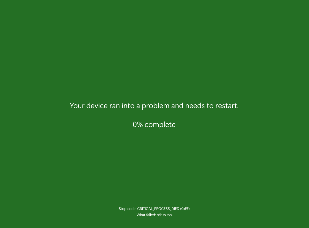
The simplified UI preserves the technical details of the error including the stop code and what specifically triggered the failure, in far fewer words than what you might remember from earlier versions like those in Windows 98 or XP. Also missing is the sad emoji face and the QR code found on later variants.

This is not the first we have heard of an updated UI for the error message, and it may not be the update's final form. According to Windows Latest, the new BSOD will be black instead of blue or green. Perhaps the green variant Microsoft showed off in its blog post is just a placeholder for Insiders?

As a Windows user and avid overclocker that did most of my tinkering in the 2000s, BSODs were a common occurrence. They were often a sign that I had pushed a setting too far although occasionally, they'd signal a software or hardware incompatibility. I eventually moved on from overclocking and developed an appreciation for a rock-solid, stable system. Knock on wood, but it's been years since I last saw a BSOD.

Permalink to story:

 
For developers and IT folks, keeping the stop code and error context is key. But for everyday users, a less jarring screen could actually lead to better support outcomes—people might be more inclined to report the issue instead of just rebooting in frustration.
 
For developers and IT folks, keeping the stop code and error context is key. But for everyday users, a less jarring screen could actually lead to better support outcomes—people might be more inclined to report the issue instead of just rebooting in frustration.

Yeah.

General rule for me: If codes 0x117 or 0x118, blame the GPU/drivers. Otherwise check RAM/OC. Failing that, any recent Windows/Driver updates?

But yeah, these days Windows is rock solid stable unless you go out of your way to mess it up.
 
Green is commonly associated with lunacy - Greenpeace, 'green' wokesters preventing proper forest management leading to horrible fires (allegedly caused by 'climate change'), 'green' wokesters protesing against any reliable form of energy generation ....

Green is the best color choice to symbolize catastrophic failures ... well done, Microsoft.
As currently green is the color synonym for red, BSOD may as well be red. It's all the same.
 
It's been green in previews for a couple years...

The new design is even calmer and cleaner, though I'd have liked to keep the QR.
 
Microsoft is historically famous for their ability to demand more from customers while providing less to them. Like a winch slowly ratcheting down on functionality as it collects more and more data, altering the foundation of your workflow to comply with their ever-worsening development priorities.
 
Wasn't this a thing when Windows 11 first came out? Why do we need another story about the same thing; changing the color of the BSOD.
 
If I remember correctly, the idea is in the future, the stop code will remain on screen rather than be missed by the user from the restart or shutdown that usually follows.
 
Microsoft is historically famous for their ability to demand more from customers while providing less to them. Like a winch slowly ratcheting down on functionality as it collects more and more data, altering the foundation of your workflow to comply with their ever-worsening development priorities.
Sounds like any employer that's ever existed.
 
Really needs a rainbow screen to be inclusive!
Good thing is when recombined we can get white to symbolise the snowflakes - who get triggered by green or another colour

FFS it is the 1st of april here in NZ , but don't think that rant about green was joke

I thought for Americans green was associated with money
 
Thank goodness, my IT days of reading a stack unwind in WinDbg are over. I never ever want to type !analyze -v ever again. Crap, I just did!
 
I think that the color of the BSOD should be configured to suite user tastes. PSOD for a pink screen of death, OSOD a for orange screen of death, MSOD for a magenta screen of death.
 
For developers and IT folks, keeping the stop code and error context is key. But for everyday users, a less jarring screen could actually lead to better support outcomes—people might be more inclined to report the issue instead of just rebooting in frustration.
Gone are the days I'd spend hours fixing glitches & enjoying doing so, need a degree now to sort out some problems, like it or love it.
 
Been a while since I’ve seen one in the wild, but I guess if it has to crash, doing it with a more modern aesthetic doesn’t hurt. That said, I kind of preferred when the screen made it clear it was time to call in that “reliable recovery friend like stellar data reovery” we all keep on standby—just in case things go sideways.

 
Back