Revamped news comments

Julio Franco

Posts: 9,097   +2,048
Staff member
The news comments have a new look and feel. We've added users' avatar and title and reorganized the layout which in my opinion looks a hundred times better.

Heavy forum users will prefer to keep at it here, which is always a valid option, but I still thought I'd bring this to your attention...

PS: All our server issues are gone (fingers crossed), so we can go back to fix and add new features soon.
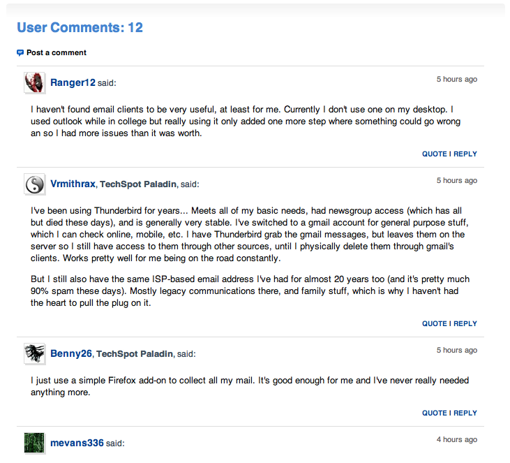
newscomments2012.png
 
Sort of related input from me rather than making another thread, for the main listing of news there is the "Read more" and "Comments(x)" line. I think most will realize that both the pic and news headline are clickable. I'd be tempted to implement the same comment count that is used for the top of the main page(little speech bubble thingy with number in it) to give more space to the actual content.
 
Sort of related input from me rather than making another thread, for the main listing of news there is the "Read more" and "Comments(x)" line. I think most will realize that both the pic and news headline are clickable. I'd be tempted to implement the same comment count that is used for the top of the main page(little speech bubble thingy with number in it) to give more space to the actual content.

I was just thinking about the exact same thing. Having the comments bubble count floating above the image, but then again there are some news without a headline image or there can be. Also it would help to know if people click more on the Read More link than in the headline or the image to actually remove that line, but we don't have that kind of data sadly.
 
"Studies suggest" (part joke, part true) that having that "Read more" link leads users into knowing there is more to read that just the excerpt, even if just visually, it works. The comment bubble suggestion is good, but is subjective as I like it where it is -- it's easier to scan.

Finally, implementing a link that opens the story in a new window/tab is yet another feature that I've thought about, but have left things where they are to avoid complexity.
 
I suppose the other benefit is that you can then add on other data to that line, likes or link to related articles or something.
Probably just me liking the look and feel being consistent throughout the site. The forum posting compared with news commenting is a little dissimilar at present, but I guess that's changing too?
 
I think it's a good thing that the news comments and the forum postings look different, makes it clear where you are and the article should be more prominent when viewing a story while on the forums every post should be treated equally.

What I've been seeing around the web is that the Read More links are used less and less in other sites. I haven't read any current data on this but people adapt and "learn the web" very fast so what was true 5 years ago might not be true now, 10 years ago everyone said to put most of your data above the fold but now we know that everyone scrolls and it doesn't matter that much if your content is interesting enough.
 
Back