First look: YouTube celebrated its 20th anniversary earlier this year and is finally modernizing its video player for the first time in a decade. The refresh may irritate some, particularly users who dislike the "liquid glass" look, but Google says the changes aim to make the platform more engaging and welcomes user feedback.
YouTube is launching a wave of visual and interactive tweaks designed to make the platform feel more vibrant, intuitive, and consistent across devices. The redesign began deploying globally on Monday in a staggered rollout. It marks one of the most comprehensive interface refreshes in years.
Google said the goal is to make YouTube "as dynamic as the creators and videos on it," aligning the app's energy with its content through cleaner visuals and smoother navigation. The overhaul is both aesthetic and functional, improving how users watch, move through, and interact with videos.
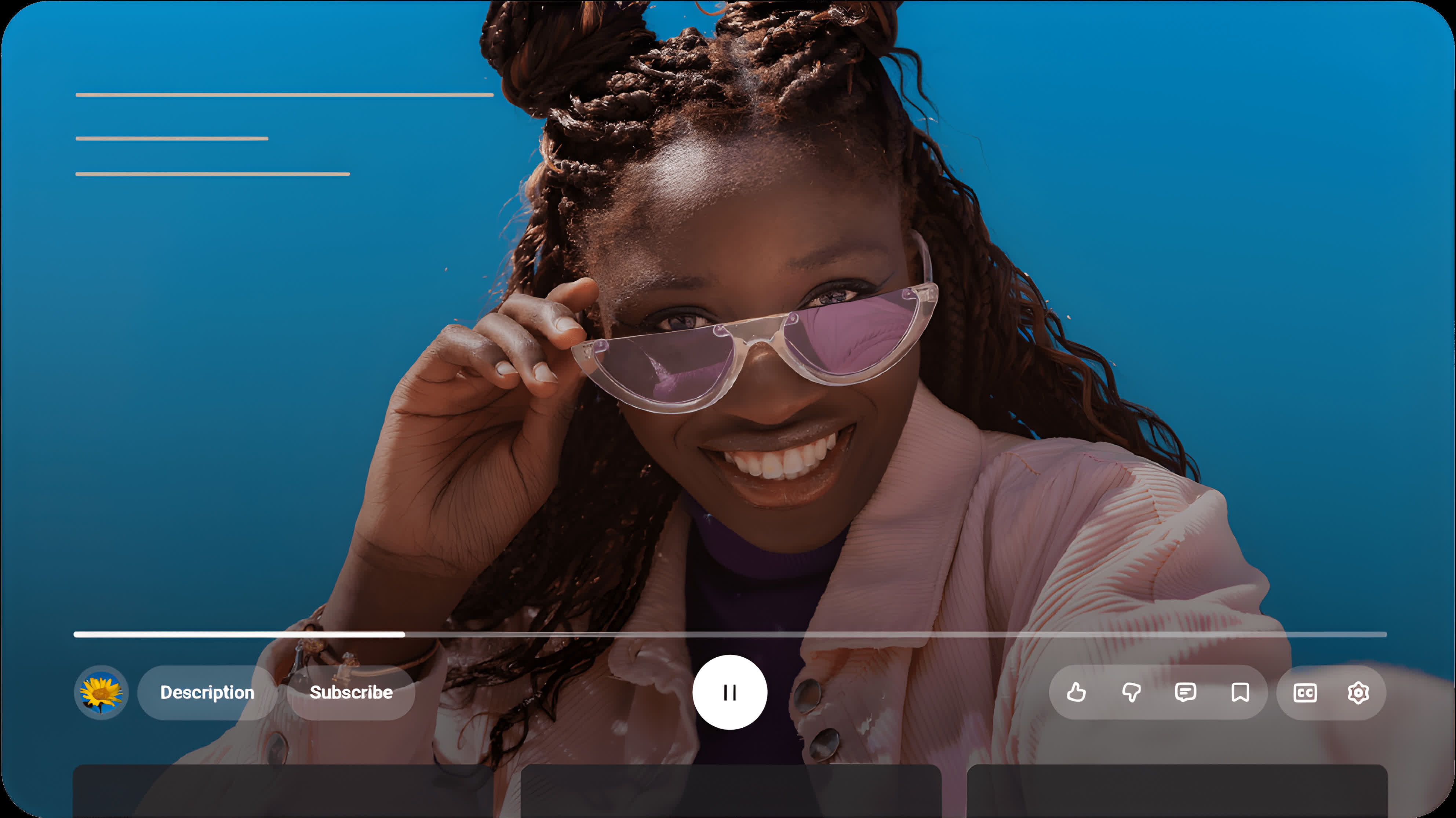
The centerpiece of the update is a reworked video player for mobile, web, and TV. It features updated controls and icons intended to be more visually satisfying while obscuring less of the screen. The rounded semi-transparent buttons evoke an Apple-like "liquid glass" aesthetic. Like iOS 26's visual overhaul, YouTube's new visuals will remain more subjective than satisfying.
In April, some users got a peek at an early version of the new interface (above), and many reacted negatively, pleading with YouTube to return to the old interface. The most significant difference between the early changes and those rolling out this week is the transparency. Google appears to have revised the layout of the controls since then, as well.
Some of the changes are more specific to the mobile version. YouTube refined the familiar double-tap gesture for skipping ahead or back, creating what Google calls a "less intrusive" seek experience. Users will also notice new motion effects and seamless transitions when moving between tabs, giving the app a smoother, more continuous feel.
Beyond the overall appearance, YouTube is emphasizing expressiveness in user interaction. A new "custom likes" feature introduces dynamic animations tied to specific types of content. For example, liking a music video might trigger floating musical notes, while sports clips could show animated effects inspired by the game. The feature will appear first on select videos before a broader rollout.
YouTube has also modernized the video-saving process. Adding clips to the Watch Later list or personal playlists now features a redesigned interface that simplifies the action while adding subtle visual feedback. Comment sections are receiving attention as well, with a new threaded reply system intended to make discussions easier to follow and read. The structured layout organizes replies beneath their parent comments – similar to Reddit – reducing clutter and encouraging more focused conversations.
Google noted that the updates reflect its ongoing effort to make YouTube "more engaging, expressive, and enjoyable" while maintaining accessibility across platforms. The company is inviting users to test the new features and share feedback directly through the app or community support channels as the rollout continues worldwide.
YouTube modernizes video player with new layout, functionality and, wait for it, "liquid glass"

