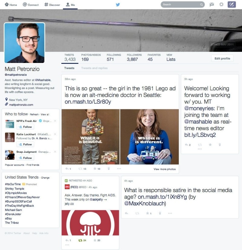
Twitter is in the process of testing a major profile redesign. The changes, which appear to be rolling out to select profiles, are undeniably familiar and borrow heavily from social networking powerhouses Facebook and Google+.
As you can see from the screenshot below, the new profile pages feature a large profile photo and a bio that is left-aligned. This layout provides a lot more room for a header photo across the top of the profile which now accommodates image sizes up to 1,500 x 500 (up from 1,252 x 626 in the current design). But these aren't the only areas that are receiving more emphasis on rich media.

The tweet stream itself has also been revised to highlight photos and instead of a streamlined vertical timeline, users now get block-style updates that better fit the data within.
It's unclear exactly how widespread the test is at this time. The microblogging platform traditionally rolls out major updates like this to a small and seemingly randomly-selected pool of users. True enough, I was unable to find any profiles that I follow with the new design. Interestingly enough, however, we're told that other profiles viewed from an account with the new design are automatically shown with the refresh.
What do you think of the refresh overall? Is it a useful and modern update or is it simply too similar to competing social networks? Is your Twitter account currently part of the test?