Netflix will let you disable those annoying auto previews

Shawn Knight

Posts: 15,294   +192
Staff member
Finally: Netflix is finally addressing those long-running, annoying auto-playing previews that fire up when you start the app and traverse its library. They’ve been the bane of viewers for around five years but now, you’ll be able to turn them off.
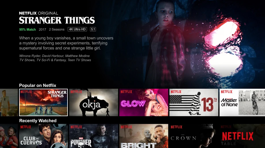
As Netflix outlines in a recent Twitter post, you can sign in to Netflix from a web browser and select Manage Profiles from the menu. Then select the profile you’d like to update. From there, simply check or uncheck the option to Autoplay previews while browsing on all devices.

Changes made are specific to that profile and will take affect across all devices.

Netflix said there might be a slight delay before the changes take effect. In that instance, you can try switching to another profile then returning to the original profile to reload it with the updated settings.

Users now also have the option of deciding whether or not they want to autoplay the next episode in a series. Like before, simply sign in to Netflix on the web, select Manage Profiles from the menu, select the profile you want to manipulate and check or uncheck the option.

Netflix notes that some people find the preview feature helpful while others, not so much. “We’ve heard the feedback loud and clear,” Netflix said.

Permalink to story.

 
What was wrong with a simple pause button, and maybe even a close button to dismiss the entire widget and recover its space?

For me it is not about always wanting it or never wanting it, it's about my specific mood at the time, what I was trying to do, and what was playing.
 
Options, Options, Options!! Service providers and developers should start having the common sense to create the options of how the users want the program to behave. Not just spitting out what THEY think is best. Let the users decide what they want. Is it that hard to give options to turn on or off certain basic features?? Sheesh....
 
@Shawn Knight Thanks! I just shut mine off. Its about time they did this. I have no interest in 99.99% of their previews.

Their AI WRT what they think I want to watch is also way off the mark, too!
 
I use the previews big time, I love using them to decide if I want to watch something new or not. It saves time on navigating to watch the trailer (if it even exists).
 
Last edited:
Jes...f...Chr...! Seriously! Why did it take so damn long to let us turn this crap off. I HATE that feature and it's the main reason I stopped watching Netflix. Plus, who wants their kids seeing crap like that play when all you're doing is trying to get to some family-friendly content? Whoever came up with the "can't turn it off auto-play" crap should be fired.
 
What was wrong with a simple pause button, and maybe even a close button to dismiss the entire widget and recover its space?

For me it is not about always wanting it or never wanting it, it's about my specific mood at the time, what I was trying to do, and what was playing.

I was thinking about this when looking through Prime and Hulu, as well. Tiny text, tons of wasted screen space. Huge images that don't lend much to whether or not you want to watch something. UI "experts" hired to do what children can do better.
 
"“We’ve heard the feedback loud and clear,” Netflix said." No you didn't. It took you years to come up with a toggle for a feature the majority of your subscribers hated.
 
What was wrong with a simple pause button, and maybe even a close button to dismiss the entire widget and recover its space?

For me it is not about always wanting it or never wanting it, it's about my specific mood at the time, what I was trying to do, and what was playing.
They did have a pause button, or you could scroll past it. But doing so every time you opened the app? Like I said in my other post, 99.99% of their previews, I had no interest in seeing, and I either scrolled past them or paused them; after four or five times doing that, anyone with an iota of sense would have figured that maybe customers don't want auto play crap, but Netflix was quite lame in this case - IMO.
 
Now all we need is an option for a simplified view with just a list of categories without having to scroll through every god damn one of them.
Ryan, if you think this is bad on Netflix, try it on Prime Video. Looking for, say, anime, one can press the remote's Down button 80-100 times to finally get to it.
They do have a Genre category, but it is also Way Down There... nasty!
 
Options, Options, Options!! Service providers and developers should start having the common sense to create the options of how the users want the program to behave. Not just spitting out what THEY think is best. Let the users decide what they want. Is it that hard to give options to turn on or off certain basic features?? Sheesh....
The simple fact of the matter is, modern consumers are so stupid and oblivious to what they actually need, they'll take whatever you hand them, as long as either their neighbor has one, or they have to get one before their neighbor.

The entire, "IoT", is built around that simple premise. "Alexa, tell me about my right to privacy"

You're right. Looking at how most "consumers" just swallow whatever is pushed down their throats, these service providers/developers will continue spitting out their so called advancements.
 
About time. Annoying as hell. Especially when you have a room full of people trying to talk while you're looking for a movie.
 
Back