Netflix's new bespoke font will save the company millions in licensing fees

Shawn Knight

Posts: 15,289   +192
Staff member

When operating at the scale of a company the size of Netflix, even the smallest of expenses can quickly add up. Take font licensing, for example.

As Netflix brand design lead Noah Nathan highlights, Netflix primarily uses the Gotham font. It’s a popular choice in the entertainment industry but as foundries move towards impression-based licensing for digital advertising spaces, it has gotten incredibly expensive to use (in the range of millions of dollars per year). After all, Netflix attracts a ton of eyes.

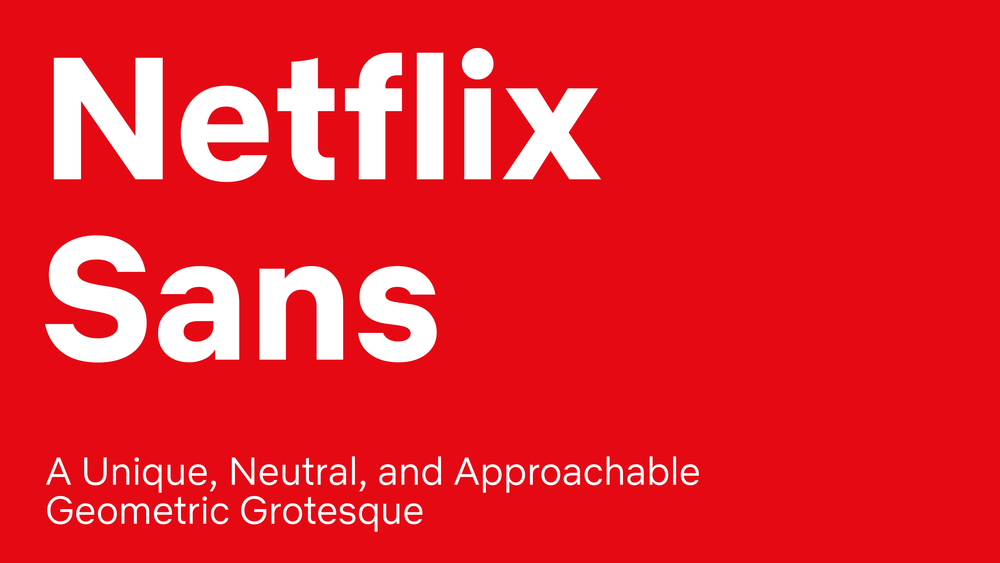
It’s no surprise, then, that Netflix has created its own font.

Dubbed Netflix Sans, the unique characteristics of the new typeface were crafted specifically to serve both functional and display purposes. It’ll save Netflix millions in expenses per year but perhaps more importantly, it gives Netflix more ownership over its brand aesthetic.

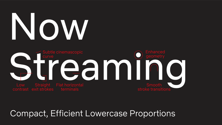
The clean and neutral lines give without taking, favoring art over distraction, and eliminating excess. The arched cut on the lowercase "t" is discreetly inspired by the cinemascopic curve that is so iconic to the brand's wordmark and symbol.

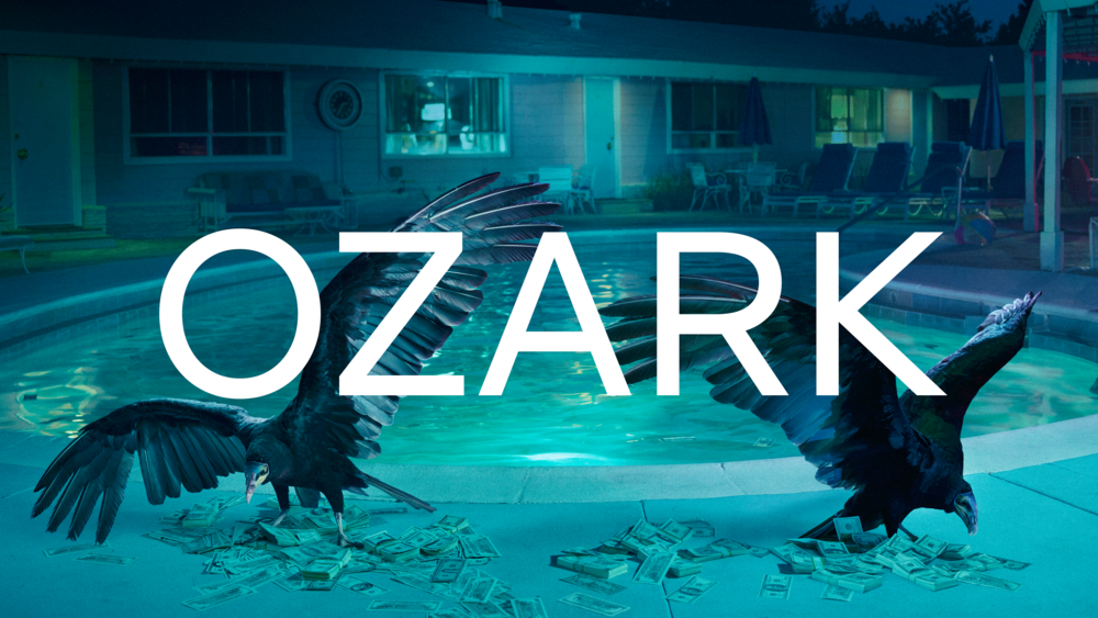
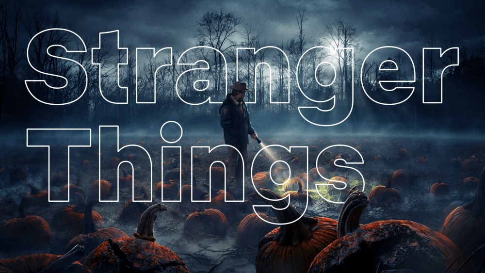
Below are some additional samples of Netflix Sans supplied by Nathan.

Design leads: Tanya Kumar, Noah Nathan

Product design consultants: Andre do Amaral, David Gallagher

Integrated production: Monique Adcock, Tanya Kumar

Foundry partner: Dalton Maag

Permalink to story.

 
What is amazing is that a company their size didn't design and copy write their own font. It's not a difficult process and software to do that is still readily available. If I were on their board of directors I would question what took so long and why isn't anyone looking at these "small things" to see what other opportunities are available ......
 
What is amazing is that a company their size didn't design and copy write their own font. It's not a difficult process and software to do that is still readily available. If I were on their board of directors I would question what took so long and why isn't anyone looking at these "small things" to see what other opportunities are available ......
Without knowing the details, I presume that they had a contract that is just now running out. Otherwise, every manager and bean counter at Netflix was asleep at the switch.
 
Obscenely myopic design choice - - now becoming an expense problem - - WHO hires these guys?

From the W3C standards body: https://www.w3schools.com/cssref/css_websafe_fonts.asp

The font-family property should hold several font names as a "fallback" system, to ensure maximum compatibility between browsers/operating systems. If the browser does not support the first font, it tries the next font.

Start with the font you want, and end with a generic family, to let the browser pick a similar font in the generic family, if no other fonts are available

Serif Fonts:
  • Georgia, serif
  • "Palatino Linotype", "Book Antiqua", Palatino, serif
  • "Times New Roman", Times, serif
Sans-Serif Fonts:
  • Arial, Helvetica, sans-serif
  • "Arial Black", Gadget, sans-serif
  • "Comic Sans MS", cursive, sans-serif
  • Impact, Charcoal, sans-serif
  • "Lucida Sans Unicode", "Lucida Grande", sans-serif
  • Tahoma, Geneva, sans-serif
  • "Trebuchet MS", Helvetica, sans-serif
  • Verdana, Geneva, sans-serif
Monospace Fonts:
  • "Courier New", Courier, monospace

Don't get me wrong, I like good aesthetics as much as the next guy, but not to ignore the cost (license fees) and the runtime bandwidth squandered to download some special favorite that may be a remote resource to my site and subject to those issues.

I'll take a $100 bonus for saving you $1,000's.
 
Back