Whether you love it or hate it, Skype's recent Snapchat-like mobile app redesign will be rolling out to all Windows and Mac users today.
Skype's desktop design overhaul initially launched for Windows Insiders back in August. At the time, Microsoft claimed that their Skype Preview "[delivered] most of the great features of [their] next generation mobile experience but [was] especially designed with desktop in mind, to take full advantage of the larger screen."
Regardless of Microsoft's intentions with this move, it comes as a bit of a surprise given the overwhelmingly negative response to the mobile app's redesign. Transferring such a poorly received overhaul to Skype's sizable desktop audience is unlikely to yield different results.
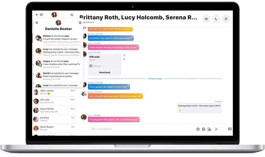
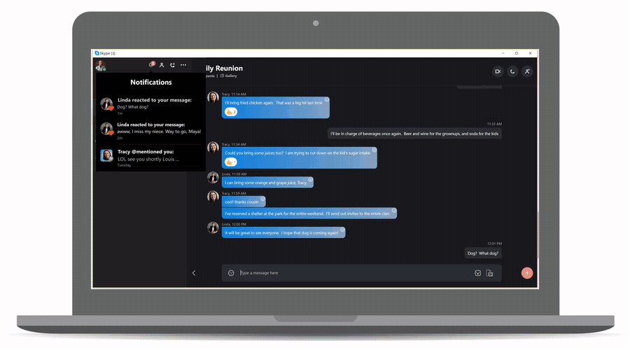
Regardless, the design overhaul does bring a few new features. Skype users now have access to chat-specific media galleries which allow users to find "shared content" -- including links, documents, images or other media -- much more quickly than before. Skype for desktop has also received an entirely new notification panel, automatically letting users know when someone reacts to one of their messages or @mentions them.
If you don't care for the new design's default interface, it is customizable - to a degree. According to Skype's official blog, you'll be able to choose a custom "color and theme that reflects your mood, personality, or time of day."
Skype for desktop's contact list has seen an overhaul, too. You can now sort your contacts by unread messages, contact status and their local time. Additionally, you can pin individuals and groups for easy access and collapse your contact list entirely to make the chat box take up the entire Skype window.
Finally, Skype has finished its transition to a fully cloud-based system which comes with its own list of unique benefits. For example, Skype will now use less battery on laptops and notebooks while allowing its users to send files (up to 300MB in size) to their friends by simply dragging and dropping them into the chat window.
