Windows 10's Sun Valley update revamps icons used since Windows 95

midian182

Posts: 9,726   +121
Staff member
Forward-looking: If, like me, your age allows you to nostalgically look at some Windows 10 icons that have remained pretty much the same since Windows 95, prepare for disappointment. The operating system’s Sun Valley update is refreshing these graphics with a more contemporary look.
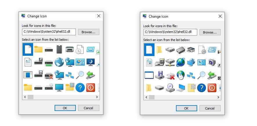
Windows Latest spotted the revamp in the latest preview builds of Sun Valley, which is set to land in October or November. In addition to adding new icons for File Explorer and other apps, Microsoft is updating the icons inside the Shell32.DLL.

Some of the icons have remained pretty much unchanged since Windows 95 arrived over 25 years ago. There are images of floppy disk and CD drives, computer chips, hibernation mode, networking, and more.

The new icons do look quite modern, with extra color and a less antiquated style. The change should give Windows a more unified appearance, rather than containing elements from different eras of the OS.

Sun Valley has been in the works since last year. It will introduce a comprehensive visual rejuvenation of Windows, including a new interface that takes full advantage of Microsoft’s Fluent Design and WinUI language. There will be plenty of subtle changes, too; box corners, such as those on static tiles and the Action Center, are being rounded, while the Start Menu will float above the taskbar instead of being attached to it.

A more welcome element of Sun Valley might be Microsoft removing many of Windows' pre-installed bloatware apps—such as 3D Viewer and Paint 3D—when the update has been applied and Windows is reinstalled.

Permalink to story.

 
I like the classic icons

Im gonna pour one out for the old floppy icons and others tonight...
One positive about Windows 10, is that it still supports the functionality of old theme packs, including alternative icons, and the classic icons still work. I also actually made some refreshed versions of old Windows 98 themes for Windows 10, using some AI programs to upscale some of the old desktop backgrounds. Just need to remember to upload them at some point.
 
Old icons still look better, maybe thats why they lasted so damn long
There is a lot of charm to them. I remember reading that a lot of the Windows 3.1 icons were done by one designer, which is part of the reason why its "design language" was so unified, before that concept even existed. That, and just working inside the limitations of the time, like only having 256 colors; sometimes having to make do with less leads to greater creativity than having unlimited resources.
 
The underlying question is: How many millions of dollars did Microsoft spend to 'develop' these new 'modern' icons?

Even funnier is that they spent however much money on the icon revamp and some of them look worse and are harder to discern what exactly the eff they are. I'm guessing those are supposed to be DVD drives, but why floppy disks on top of them? Don't confuse the kids like that.

Oh wow, look! They stopped italicizing the A on on that one icon. HUGE improvement, Microsoft. Bravo! I had always wondered why it was italicized. Now I can finally put that question to bed.

I would make even more fun of you, but you just made several million bucks while I was typing this. Can we get some new icons for My Computer, Computer, This PC, or whatever the name will be on the next version?

Thanks, Uncle Bill and Aunt... ohhh, dang.. Sorry... too soon?
 
I always use old icons in W10. "Improved" version looks like accident in paint factory. So now I have to archive old shell32.dll too. Really M$ W10 is such a turd its incomprehensible. Last version which was reasonably inoffensive was 1803. I got the rudest of wakeups when installed 1909 I'm now on new machine.

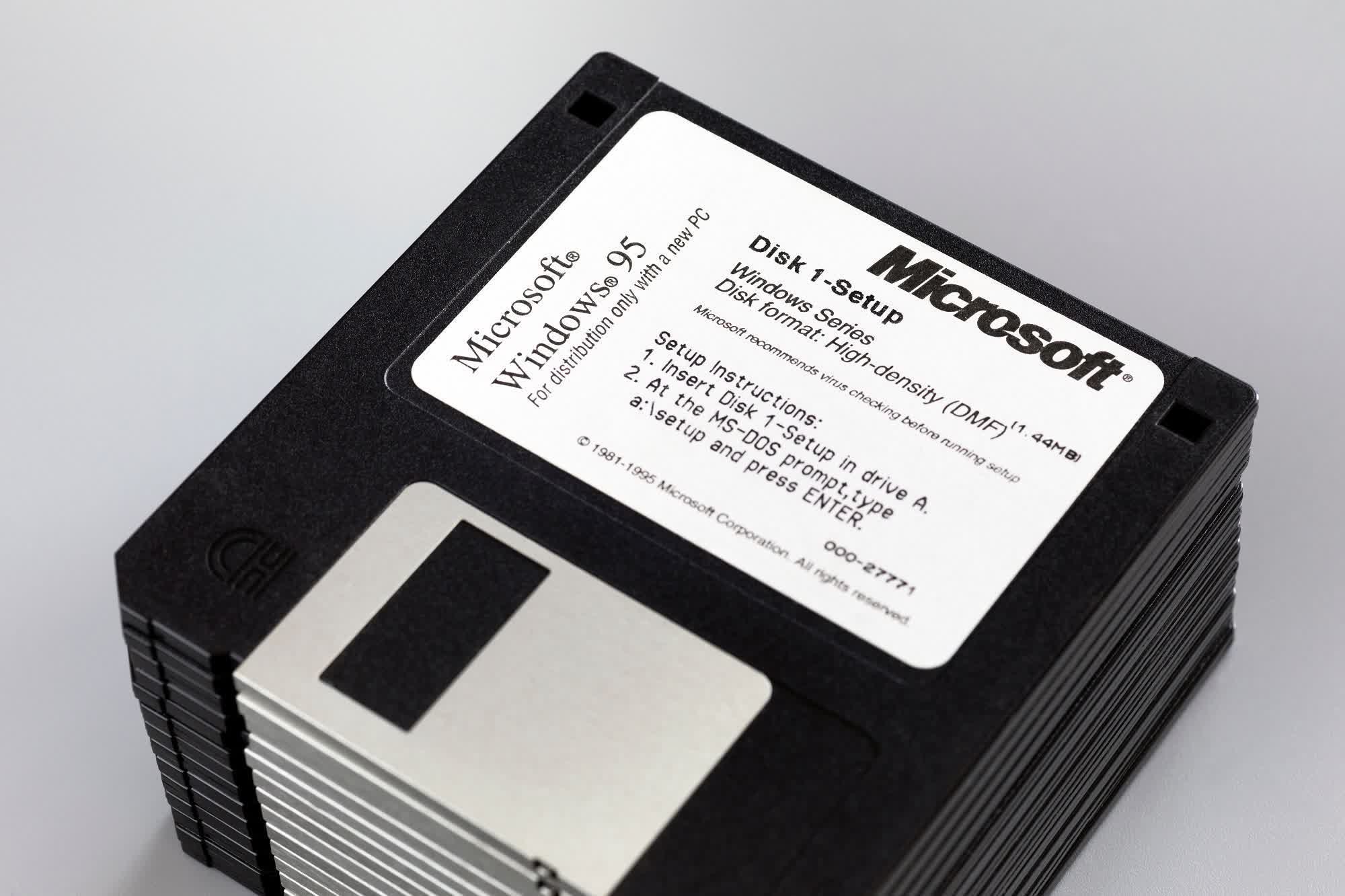
As for floppies. I thought there is no longer support for that ancient piece of equipment.

M$ stop screwing around with icons and finally abolish that stupid compatibility mode with A and B letters as drives names. If unix/linux can start with sda, Windows can also start with A: as a system drive. What's the point of keeping this ancient design if (unsupported) floppy will never see GPT partition anyway. Give people choice at system install to start with A or legacy mode with C. After 2 years nobody will remember that legacy mode even exists.

Give user a choice to pick separate volume for Users during install. I beg you.

I'm so passionate about actual improvements, but M$ doesn't care.

There is so much good to be done and yet Redmond giant burns millions of $ on icon redesign. They should sent a police there to find out if they are drunk, on high or both. Certainly they are not clean.


Ahh one nice example what kind of garbage 10 is.

Finally got my 3090 (I'm broke, sold many body parts mine and few people I know). Anyway Windows Task Manager when I was running multiple 1080Ti never reported GPU load properly. Always was showing like 1%. I was very happy that finally with only 1 card WTM will work properly. Nope...

Rendering 8K* and WTM shows load like 6%. in HW Info 3090 is loaded 100% on core/video engine/ bus, 45% on VRAM. What's the point of this [colorful description of something useless]!!!

* - I tell you rendering 16:10 8K in 90 minutes when it was 8h 2 weeks ago put things in perspective!, 15min 4K render is now just like a preview, pure amazeballs!!
 
As usual, my heart is all aflutter with this latest largess from Redmond. Long live Satya Nadella..!

Even his silent but deadly brain farts should be lauded as masterstrokes of creativity.:poop:
 
I can't get myself to care that much how the icons look. I guess people are unproductive if they just stare at the icons and feel strongly about them. The good old nature beats staring the desktop. I'd say the new icons are OK.
 
I would have thought by now the floppy disk icon would have been removed. Do we have a USB thumb drive icon?
"Computer" already tells you that it's a "removable disc" in place, despite the fact that the icon is that of a standard internal drive. How much more of a clue do we really need?
 
There is a lot of charm to them. I remember reading that a lot of the Windows 3.1 icons were done by one designer, which is part of the reason why its "design language" was so unified, before that concept even existed. That, and just working inside the limitations of the time, like only having 256 colors; sometimes having to make do with less leads to greater creativity than having unlimited resources.
And here I thought the Windows 3.1 icons were designed to make do with only having 16 colors! (Unlike OS/2, which tried to use more colors than they had, so you saw ugly dithering patterns everywhere...)
 
Back