Windows 7 - Is there anyway to get XP style icon selection in Win7?

Status
Not open for further replies.

Karmashock

Posts: 223   +0
The most annoying thing about windows 7 is that the icons have these giant selection areas that are well beyond the size of the actual icon. They've these tile selection areas with the icon picture in the middle. XP only counted a click ON the picture icon as a click on the icon.

I would much rather get rid of the tile like selection system and go back to pure icon level selection.


Is there anyway to disable tiled icon selection?


I am viewing the folders in "medium icon" view but that just gives me smaller tiles. I want XP type selection.
 
what you can do is right click your desktop and go to view and uncheck align icon to grid and then you can more the icon closer by hand
 
That only works on the desktop. Within folders that doesn't work.

I've done some research on the issue and it looks like MS decided to force everyone to not have that option. Personally, this is a deal breaker for me. I don't mind this feature on my laptop but on my main computer its unacceptable. I'll go to linux before having this forced down my throat.


I hope MS stops doing this sort of thing. Forcing everyone to use uncomfortable interfaces when we've become accustomed to the older conventions is not a good strategy. If their improvements are liked then people will leave them enabled. There's no justification for just removing them entirely from the OS.


Anyway... I'm going back to XP on the main system. I like many of the improvements especially the ones you don't "see" in windows 7. But the GUI is frustrating and there is a noticeable performance hit. Oh well. It's just as well, their silly 64 driver rules forced me to use the 32 bit version anyway (Win7 will not let unsigned 64 bit drivers load. When those are the primary RAID drivers it's a bit of a problem.)...
 
of all the things to complain about its that?! not that theres anythng to complain about in the first place. win7 is great its more neat and better looking than xp. what are you gonna do when MS stops supporting xp?(that will be soon btw).
 
Support has been extended out to 2014 for WinXP - and if it works for you then by all means keep using it. I have to admit that your complaint does seem trivial, but then again I don't know how you use your machine and what kind of issues this actually brings you on a day-to-day basis.
 
of all the things to complain about its that?! not that theres anythng to complain about in the first place. win7 is great its more neat and better looking than xp. what are you gonna do when MS stops supporting xp?(that will be soon btw).

It's not a minor issue. The folders are much less useful. If push comes to shove, I'll got to linux over this...


Gnome lets you manually sort folders. So I'll just install Ubuntu and say goodbye to windows. Further, as of Vista/windows 7, Linux is actually more compatible with windows software then windows 7. I've been playing with Wine and it works better with a lot of programs then windows 7 does.
=================================================
Support has been extended out to 2014 for WinXP - and if it works for you then by all means keep using it. I have to admit that your complaint does seem trivial, but then again I don't know how you use your machine and what kind of issues this actually brings you on a day-to-day basis.
Let me explain how these problems are major then.

1st, if the icon selection size is so huge it means the white null area around icons is actually very small and very hard to find. That makes dragging and dropping difficult. It also makes right clicking on the white space to bring up the folder context menu difficult. Why extend the selection size anyway? It doesn't provide any additional functionality. It's just bad.

2nd, and this is the real deal breaker for me... Manual sorting of folders is very important for me. I have some folders with files that all must be in the same folder and cannot be moved because they have associations. At the same time, many of the files are very different without seeming different to explorer. Explorer doesn't understand what they are or how they have to be organized. What I need is the same level of control over folders that i have on the desktop. I've had that since windows 95. Why take that away? Since when did removing features become a feature? There are a few folders that have to be managed like this and without manual sorting they're a nightmare.


What is especially galling about this situation is that they could give me this back very easily. Yet I'm being forced to use the OS in a way that is unnatural to anyone that has used it for years. Why? I mean, the primary reason someone would buy Win7 is because they want the latest version of windows after the last version. Well, that implies a high degree of similarity. Further, windows XP could be made to look EXACTLY like windows 95 if you really wanted that. I personally don't but they were considerate enough to offer that option. While many like the looks of windows 7, no one should be forced to use a GUI that is unfamiliar.

It's hardly the only problem with the GUI. The control panel is a horror show... there are all sorts of other issues. Anyway, MS had better wake up quick or they're going to lose another customer to linux.
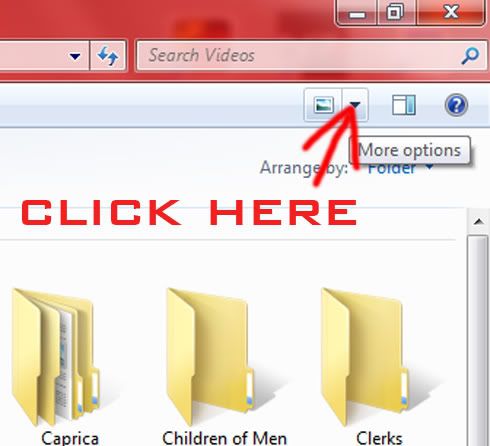
 
if you having problems with software compatibility then the software is REALLY outdated
1.
Untitled-2.jpg

2. search Google for win 7 explorer replacement
3. on the Control Panel Click on the View by drop down menu arrow, and select small icons
 
You could make the icons the same size as the selection area, but I'm guessing that would defeat the purpose. I use details and list views all the time, guess that's why I didn't really notice how annoying that is. Just FYI any Linux eye candy does the same thing usually, especially KDE.
 
You could make the icons the same size as the selection area, but I'm guessing that would defeat the purpose. I use details and list views all the time, guess that's why I didn't really notice how annoying that is. Just FYI any Linux eye candy does the same thing usually, especially KDE.

The biggest issue with the selection area is that the dead space between icons is gone. This makes drag and drop less useful.


What possible benefit am I getting in return for losing drag and drop?


As to KDE, yeah I noticed that. Gnome however lets me do what I want. So ubuntu works.
 
Status
Not open for further replies.
Back