 Twitter has become one of the most popular networks on the internet with its name now a household term just about everywhere. But new information surfaced by writer Nick Bilton, shows that the company wasn't always going to be called what it is now.
Although the name seems normal at this point -- it most certainly sounded a little weird to some at first -- based on Bilton's findings we should probably be thankful it ended up as Twitter.
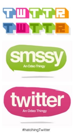
During research for his new book about Twitter, Bilton came across some internal emails regarding choosing a name and logo for the service back before it was introduced. Founders of Twitter considered a number of different names for the site including Twitch, Smssy, Friendstalker and the vowelless Twttr, before landing on the final name.
As you can see in the images (left), the company also had a number of logo ideas in the running, some of which better than others. According to Bilton, most of the early logo designs were created by Twitter co-founder Biz Stone. The first version was the red and green colored oval with white lettering, along with another design that was described as having a “retro atari vibe.”
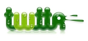 Later, there was also another mockup (right) done by co-founder Noah Glass that for a short time was the face of Twitter. Let's just say it isn't our favorite, but Noah thought otherwise: “This logo is engaging and visceral. It feels like something. It compels the viewer to feel,” Noah wrote in an internal email. “The current iteration of our product is about feeling. Not about us feeling, but about our users feeling. I believe that this logo does exactly what we want it to do.” He went on to say that this green design represents “youthfulness," and that "old is boring…..and nothing is worse than boring.”
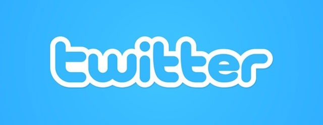
Finally (and thankfully), the folks at Twitter landed on the traditional blue design by Linda Gavin, which, believe it or not didn't sit well at first with Twitter users according to Gavin. She said in an interview last year that “shocked Twitter users" complained about the redesigned logo initially saying that it "looked like a Japanese chatroom for teenagers." Well, lets just be thankful we don't have to look at the not-so-pretty Glass design everyday.
https://www.techspot.com/news/54663-check-out-these-early-names-and-logo-designs-for-twitter.html
")