Intel applied machine learning to GTA V, and it looks too real

Shawn Knight

Posts: 15,294   +192
Staff member
Editor's take: Photorealistic graphics once felt like the be-all and end-all of video game development. As technology advanced over time, devs were able to bring stunning imagery to life. Yet, something strange happened. Graphics starting looking too good – colors were exaggerated and the lighting was too perfect. Everything looked great, mind you, but it still didn’t look real. There was unnaturalness to it all, and after seeing the latest work from researchers at Intel Labs, I’ve come to realize that devs likely avoided the realness of the real world on purpose.

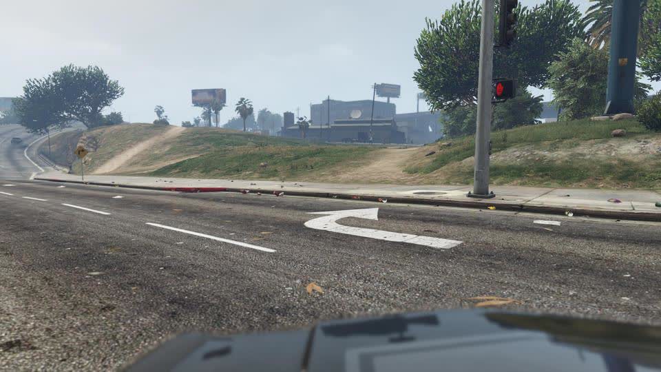
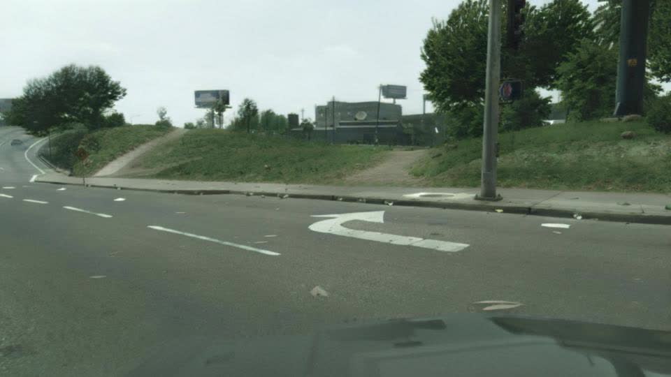
The researchers’ work centers on enhancing the realism of synthetic images – in this instance, taking Grand Theft Auto V and making it look realistic.

Their approach involves taking a rendered image from the game and passing it through an image enhancement network to create an enhanced image. The method further extracts a set of rendering buffers from the game, which includes data like camera distance and glossiness, and passes it through a g-buffer encoder network. There’s also a perceptual discriminator that generates a realism score, and as you might have guessed, real-world images are also fed into the algorithm.

It goes way deeper than that (the full paper on the subject is available for those that wish to dig deeper), but as you can see, there’s a dramatic difference between how the game normally looks and how it looks with the photorealism enhancement.

GTA V vs. ML

Sure, it looks way more realistic, yet oddly enough, it’s too realistic… borderline creepy, even. But, maybe that's just my opinion. What do you think? Would you want to play a version of GTA V that looks hyper realistic, or does this "enhancement" push past the boundary of entertainment?

Image credit oneinchpunch

Permalink to story.

 
The "citiscapes" data set has that same look. I'm not saying the city doesn't looks like that at least *some* of the time but I would like to see the full range of samples that feed the algorithm since with just a few tweaks you can get a very dramatically different set of images under the exact same lighting conditions and even with very similar equipment with just a few tweaks.

But even if all that is taken into account, videogames looking like well, videogames, is no different than movies that make aesthetic choices when presenting it to an audience to the point that different decades of movies very often share very distinct characteristics that change with time. Photography is art after all and so is rendering on videogames.
 
Looks great to me (with further refinement to be done), just wish they had uploaded to Youtube in a higher resolution.
I wonder if that's part of how they achieve the effect. Render the images at a low enough resolution where you can't easily spot the flaws in the effects they're applying. (Or maybe they just don't know how to YouTube/video properly, but that would seem odd considering their field of study)
 
The last time I saw so much green tint, I was playing Fallout 3. :D

"What do you think? Would you want to play a version of GTA V that looks hyper realistic, or does this "enhancement" push past the boundary of entertainment?"
I think it depends on the underlying game. It's always fun to tweak Skyrim to the limit but that by itself does not make a good game. The biggest problem I have with the demand for photorealism in every game is that the more "real" you make a game, the less suspension of disbelief comes with it, gamer expectations get higher, and half the time the devs ending up biting off more than they can chew in terms of still having a finite budget & timetable. Even worse is where you go ultra, ultra real and people will then start nit-picking over the most trivial of things. But then the next minute you go replay Bioshock and have no issues with that art style because no similar "expectation of photorealism" = more "suspension of disbelief" and you find yourself actually playing the game to relax instead of pausing to analyse it every 5 seconds.
 
Last edited:
Interesting use of ML, something like this could be used to help developers get the better light color and texture colors to increase realism. It's definitely not perfect though, it looks like a green filter has been put over everything. The sky looks dingy gray, I'm looking at my window here and there are similar clouds outside and the sky behind them is a bright beautiful blue color. It's far from perfect or even photorealistic. But the road, especially, looks much better. Games almost always have really unrealistic looking roads. For one thing the textures on the roads often look too sharp in the distance, like they do in the unenhanced pictures here. The enhanced photo actually reduces the sharpness on the road substantially at a distance which is much closer to what we actually see and gives a better perception of depth.

I would like to see ML used for game optimizations. I think its a natural application of ML where the games graphics can be enhance or reduced more accurately for the best performance to quality. While I like having control over my graphics settings as a PC gamer, it would be nice to have preset optimization options that adjust levels for your specific hardware, not just Medium High and Ultra, but presets that adjust all the advance graphics options. Nvidia does this a little with GeForce Experience (and I don't know if that is ML driven or just through testing), but I think these optimization could be within the game itself to recognize your GPU/CPU available RAM, etc.
 
It does look more real but that's not what most people are after in a game. I think most want escapism rather than reality. If they carry on with this then there'll be traffic queues at every junction rather than imaginary open roads.
 
Why are the ML pix so green, flat, and dull? I must be missing something because well, this seems obvious.

I think my area looks more like the GTA V pix. But - no graphics expertise.
 
Why does the games version of reality have to look like our actual reality? I don't really mind if it looks "too real", it's escapism, and maybe I like to think it would be nice to live in world with perfect light for example. I would love to see this used on AC Odyssey, I partly play this game just for how gorgeous it looks, but this would push it to an amazing level.
 
Looks great to me (with further refinement to be done), just wish they had uploaded to Youtube in a higher resolution.

That is 100% intended. Notice they used the word 'interactive' with frame rates. It is probably running at 480p and sub 30 fps. Wonder how much effort and compute it would take to improve this?
 
"It goes way deeper than that (the full paper on the subject is available for those that wish to dig deeper), but the proof is in the pudding. As you can see, there’s a dramatic difference between how the game normally looks and how it looks with the photorealism enhancement."

I am being pedantic here, but the proof is not in the pudding. The proof of the pudding is in the eating. Your analogy is completely wrong. The saying implies that the pudding may look nice, but it will not be proven to be nice until it is eaten.

I have no idea how so many people get this simple analogy so very wrong, but it seems to be getting more common.

Pedant mode off.

I am not a fan of the new manipulated renders. I think the way the game creators released it is perfectly good, because it is afterall, a game, so it should look like a game not a holiday snap.
 
You guys should do a feature on Metro Exodus enhanced edition. It’s genuinely the most visually impressive working game I have ever played. And it’s free! And it runs better than the original Metro Exodus! It is very much “enthusiast” level gaming.
 
As far as I'm concerned, all the machine learning scenes look too green.

Beside if you want real life scenes to have better color saturation and contrast, all you have to do is wait for the right light, and slap on a pair of polarized sunglasses.

Game developers have basically been copying the, "picture postcard look", which photographers have been doing for decades, and that's, waiting for the right light, and slapping on a polarizing filter.

Besides, in GTA for example, wouldn't you want the old lady you just hit's brains and blood on the windshield to be nice bright , healthy, pink gray, and red?

Anyway, if you really want "reality, all you have to do is dial back the contrast, the color saturation, add a slight blue shift, along with more trash on the streets

Here, it's still good an ugly, it's just not way too greenGTA_AI_2021-05-13-image-16 copy.jpg
 

Attachments

  • GTA_AI_2021-05-13-image-16 copy.jpg
    GTA_AI_2021-05-13-image-16 copy.jpg
    118.1 KB · Views: 1
Last edited:
How is this "creepy"? Not a very appropriate adjective to describe this, IMHO. But to each their own, I guess. Colors a bit muted, but not "creepy"...

Looks better to me.

yes it's not creepy, it all depends on the weather & the lighting from weather. The scenes they rendered looked like a cloudy or overcast day. Nothing creepy about it (unless u find cloudy weather creepy!). I imagine if it was a sunny day it'd look much more vibrant.
 
This green tint...looks like The Matrix movie. It's all coming together now.

Your monitor needs color calibration. :/
The whole thing has blue tint, green is blueish, red is pulling into violet and so on, like you've put monitor to 9600K instead of 6500K ....
They've said themselves the images used were from dash-cams, meaning, the recording was done through windshield, which is glass, and depending on the class of the car, it can be up to 30% tinted, it's usually toward the blue hue which dash cam exaggerates. So is this final result. While good to a point, it's dash-cam "realistic" , not human vision realistic.
 
Your monitor needs color calibration. :/
The whole thing has blue tint, green is blueish, red is pulling into violet and so on, like you've put monitor to 9600K instead of 6500K ...
Well no, green is a primary color. So, Green is green, and all of those pictures are too green..

When "green goes to blue", that color is called, "cyan". An when "red goes toward violet", that color is called, "magenta".

It helps if you try and remember a gentleman named, "Roy.G.Biv",.

To recap. there are three primary colors, and three "secondary" colors, in this order: Red, yellow, Green, cyan, Blue, and magenta, then back to red.

This explains "subtractive" color printing theory:

And here's "additive" color theory:

I can assure you that, (IMHO), all of those " AI interpreted images", are too green. My monitors are set at about 5600 K (daylight color film balance, slightly warm), and I was able to neutralize the color by dialing back the drive on the green color channel. (via a "levels layer", in Photoshop..(see photo in post #22)

FWIW, there is no such thing as "windshield color balance", since your eyes (in concert with the brain) adjust to any reasonable color offset the windscreen may introduce. Thus,while any color recording device, (film or digital) may "see" color differently than a human, those results have to be adjusted back to what a person expects to see.to be realistic. A classic example of this is the "skylight 1A" filter, which removes blue from pictures taken in shade, which a human would interpret as, "too blue"
 
Last edited:
Back