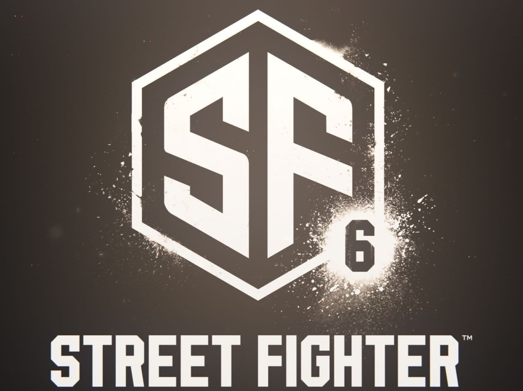
Facepalm: There was a lot of excitement surrounding the announcement of Street Fighter 6 yesterday, but one thing fans aren’t so keen on is the new logo. Rather than keeping with the familiar look and fonts that the series has used since it launched in the 1980s, Capcom appears to have opted for an $80 adobe stock image with a few alterations.
From 1987 through 2016, the Street Fighter games’ logo has used a combination of the name and roman numerals in black, yellow, orange, and red colors. The style has changed slightly over the years, but it’s remained instantly recognizable and reassuringly familiar.
However, with Street Fighter 6’s logo, Capcom’s deviation from the previous entries is as jarring as a dragon punch from Ryu himself.
This is a disaster pic.twitter.com/EKpZvU0GH1
— Danny Sweeney✨ (@Dann_Sw) February 21, 2022
It appears that Capcom was aiming for a look that's very modern and different, something companies have been known to do when going for the ‘all-new’ approach. But fans are far from impressed.
Adding to Capcom’s misery is Ars Technica's Aurich Lawson (via Kotaku). He noticed something is amiss with the picture: the Street Fighter 6 image is almost identical to an $80 stock logo on Adobe’s stock images site.
The new Street Fighter 6 logo is $80 on Adobe's Stock site
— Aurich (@aurich) February 21, 2022
I don't even know what to say. I knew it was generic but I didn't realize it was this bad. They searched for "SF" on a stock logo site and rounded a couple corners and added the 6
I cannothttps://t.co/SViXFjElou pic.twitter.com/yOzYePaYfV
There are a few differences between the two, beyond the 6 in the corner and the (very bland) STREET FIGHTER text; the corners are rounded in parts, a few angles of the letters have been changed, and the border is thinner, but it’s impossible to deny that these look very, very similar.

There’s always the chance the SF6 logo is just a placeholder, and Capcom is still working on the real one. Even if it isn’t, don’t be surprised if the company suddenly decides that a revamp is in order, one that doesn’t resemble a stock image.
https://www.techspot.com/news/93503-street-fighter-6-logo-edited-stock-image.html
