Microsoft begins rolling out revamped app icons to Windows Insiders

Humza

Posts: 1,026   +171
Staff member
The big picture: Microsoft's monochromatic app icons have spent quite some time in Windows 10, but things are soon set to change for consumers, given that the company started pushing out new colorful icons to users in the Windows Insider program. The changes come as part of a design revamp meant to visually unify Windows 10 with Microsoft's offerings on other platforms, and more importantly, with the company's own foldable-friendly Windows 10X coming later this year.

We learned about Microsoft's plan to redesign 100+ Windows app icons in December last year, with a few of them appearing in Windows 10X preview screens. The company's Office apps made their Fluent Design transition even before that, and now other icon redesigns are making their way to Fast Ring insiders, meaning that a sea of Windows 10 users will soon get to experience them as well.

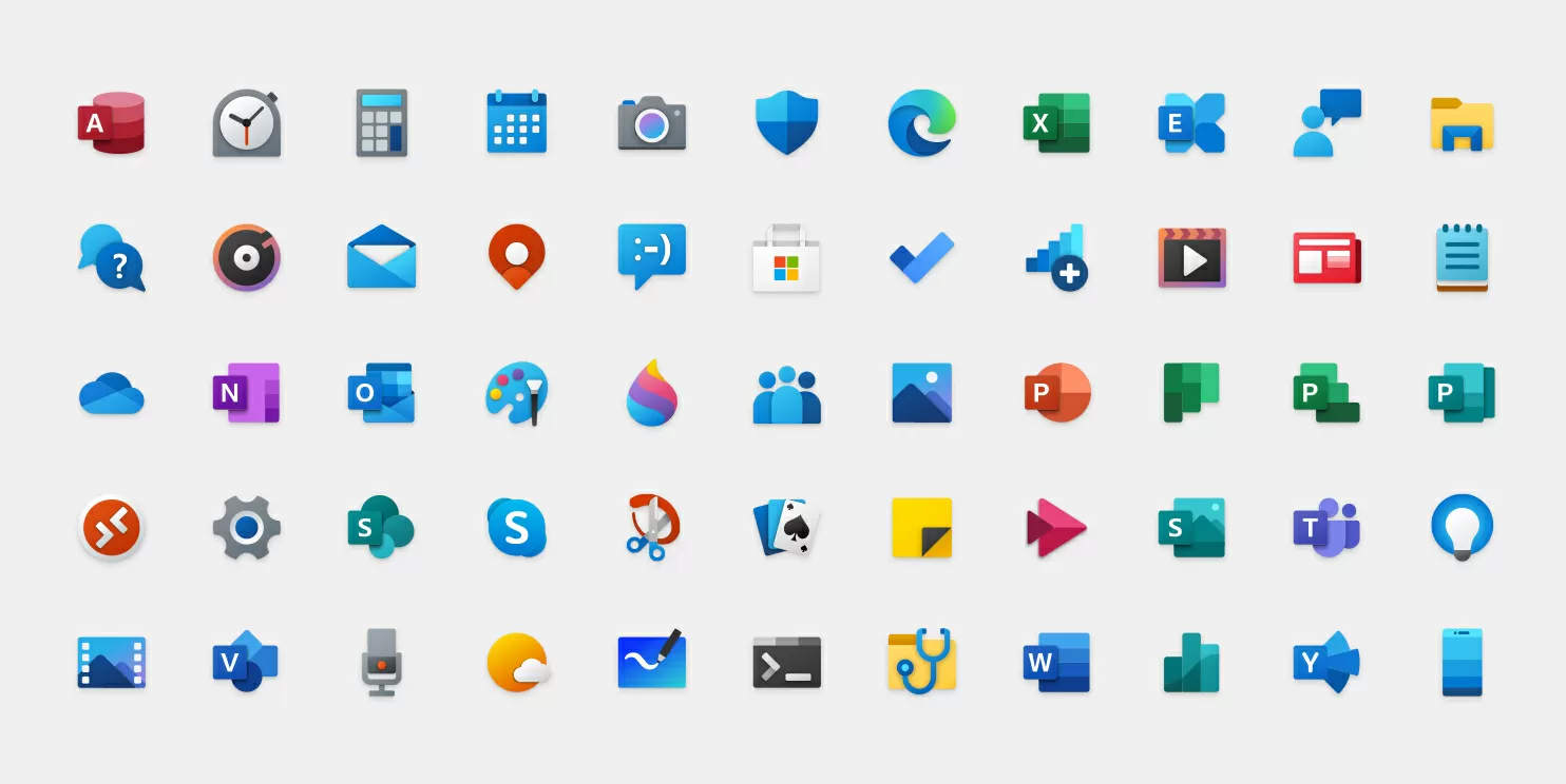
Alarms & Clock, Calculator, Calendar, Groove Music, Mail, Movies & TV, and Voice Recorder are the first built-in apps to get new icons, with plenty more to follow. They all bear consistent design cues like rounded corners and color patterns of the company's fluent design language, and it would be nice to see this visual uniformity reflected across more places in Windows 10, even if Microsoft's primary focus seems to be redesigning its cross-platform apps.
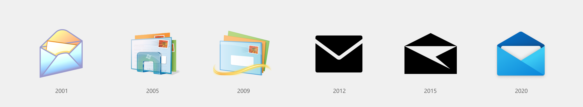
In her Medium post, Microsoft's Design Leader for Windows and Devices, Christina Koehn, discusses the evolution of Windows and its icons and notes that with four connected devices per person (estimated), there is a need for simplicity at the systems level for Windows designers. She also comments on Windows 10's Start Menu and tile interface:

Flat, monochrome icons look great in context of colorful tiles, but as more icon styles enter the ecosystem, this approach needs to evolve. When icons in the taskbar and Start menu are different styles, it creates more cognitive load to scan and find applications. We needed to incorporate more visual cues into the icon design language using our modernized Fluent Design Language.
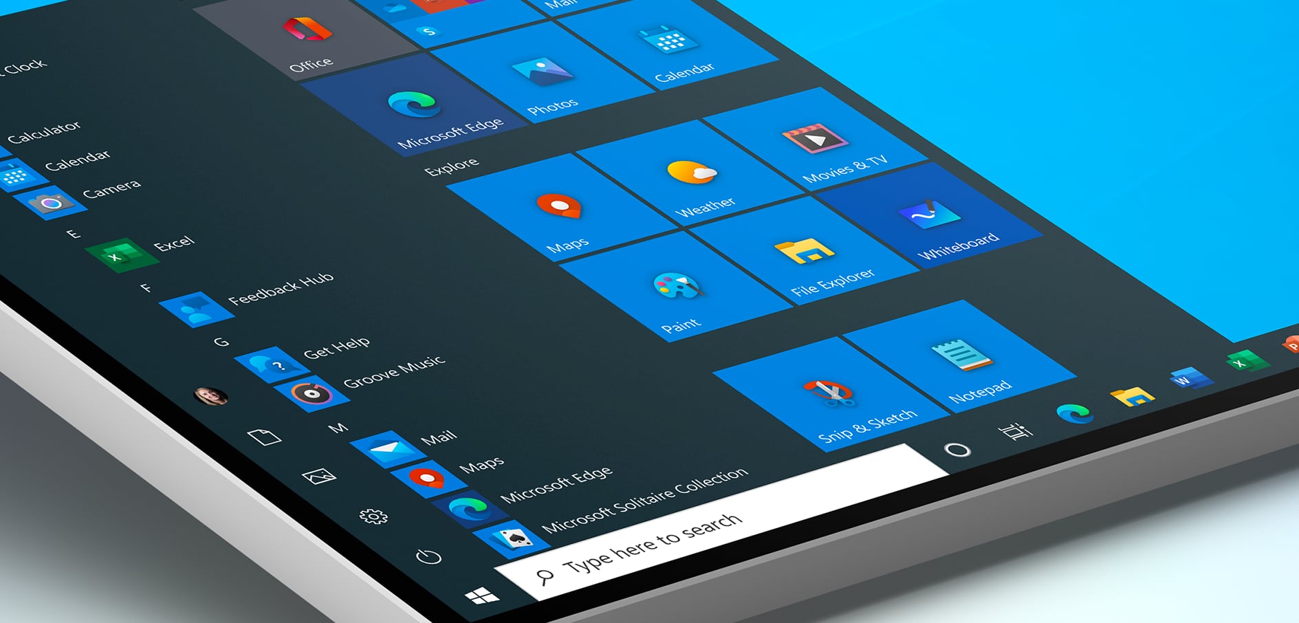
It remains to be seen how Microsoft evolves the design of its core features like the Start Menu, File Explorer and even the controversial Metro-era tiles interface, among several others, but the new icons should start appearing to Release Preview testers anytime now, alongside a new Windows Update interface that lists optional driver updates from partners to let users decide on their download and installation, giving them more control over updates.

Permalink to story.

 
I kind of liked the skeuomorphic, 'glass', colourful but not intense design of Windows Vista and 7 (which was better than Apple's skeuomorphic stuff).
The new ones are good, and very 'clean', but rather boring.
 
“When icons in the taskbar and Start menu are different styles, it creates more cognitive load to scan and find applications.“

How about the “cognitive load” it takes to remove Cortana and the rest of the bloatware I need to disable via registry with each vanilla install?

I can’t spend too much time thinking about the amount of money these people get paid to ‘fix’ this kind of stuff.
 
If this is what they are focused on I can only assume Windows is bug free. Well done everyone :) /s

I quite like the mail icons up to 2009, then it all seems to go to pot. I could understand it if we ran 4 colour desktops or something but that hasn't been the case for a very long time. So why does the icon start to look like something I might have crated myself in 5 minutes on Paint.
 
I kind of liked the skeuomorphic, 'glass', colourful but not intense design of Windows Vista and 7 (which was better than Apple's skeuomorphic stuff).
The new ones are good, and very 'clean', but rather boring.
Skeuomorphism might make a comeback through Neumorphism.
 
UI design unity has been the no1 most requested thing users wanted in windows 10. Hopefully MS updates more than just icons when it come to the UI.
I do love having Control Panel and Settings and in Settings, under Mouse options, you have just 4 useless things to change (and a bunch of empty space) and then if you open up "Additional mouse options" you have Control Panel version of mouse settings which has all the settings that you would want to change like mouse pointer speed and so on instead of just having all the mouse options shown at once which is sensible. How can they mess up something that simple is beyond me.
 
I do love having Control Panel and Settings and in Settings, under Mouse options, you have just 4 useless things to change (and a bunch of empty space) and then if you open up "Additional mouse options" you have Control Panel version of mouse settings which has all the settings that you would want to change like mouse pointer speed and so on instead of just having all the mouse options shown at once which is sensible. How can they mess up something that simple is beyond me.
It's change for the sake of change. They can't possibly admit they got it right the first time, otherwise no one would buy the newer product.

Everything that comes out of "Windows insiders" forum, seems like it was generated by a bunch of whiny, needy, butt smooching, sycophants. I'm sure of course, those people are really nothing like that. (Or am I)? :confused: ;)
 
It's change for the sake of change. They can't possibly admit they got it right the first time, otherwise no one would buy the newer product.
That might be one of the reasons people are not buying it. Actually, No need to worry about that since they forced everyone from W7 to switch and it's mostly free or $3 on eBay (Overpriced IMO).
 
That might be one of the reasons people are not buying it. Actually, No need to worry about that since they forced everyone from W7 to switch and it's mostly free or $3 on eBay (Overpriced IMO).
it's a C H O I C E -- and some (like me) giggle that it will be forced -- don't hold your breath
 
That might be one of the reasons people are not buying it. Actually, No need to worry about that since they forced everyone from W7 to switch and it's mostly free or $3 on eBay (Overpriced IMO).
The low price of windows 10 is intentional. Hell, MS is still giving it away for free in some cases. The time when you bought windows is coming to a close. This is why even without a key you can still use Windows 10 indefinitely (sans some customisation options).
 
Is there any way to change/revert this back to its original?
IMO it looks horrendous and doesn't match the look and feel of the startmenu or the dark Windows colour theme either.
 
Back