Yahoo's Marissa Mayer unveils redesigned homepage

Shawn Knight

Posts: 15,296   +192
Staff member

Yahoo CEO Marissa Mayer took to the company’s official blog earlier today to announce a new homepage design. The executive describes the redesign as a more modern experience that’s more intuitive and personal that’ll help bring you the very best that the web has to offer.

A popular web destination with more than 700 million monthly visitors, Yahoo has been in need of a facelift for ages. The site retained the dated layout that helped bring it to prominence over the years but most agreed that it was time for something new. With Mayer now at the helm, that is exactly what the new Yahoo is.

yahoo redesign marissa mayer webpage

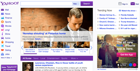
As the New York Times highlights, Mayer has done away with the low quality advertising and replaced it with useful features like an “infinite” Twitter-like news feed and a content stream from Facebook friends. The site is now optimized for smartphones and tablets and thanks to some behind-the-scenes improvements, it’s now faster than ever.

There’s a new Trending Now section that shows visitors what’s popular at any given moment. The company’s familiar services links can still be found on the left side of the page while widgets like stocks and weather can be customized to the user’s preference.

Mayer notes that the site will be rolling out to US users over the next few days. The company plans to make continued changes and improvements over the coming months, noting that today is just the beginning of what’s to come.

Permalink to story.

 
For me it looks plain and simple and not as functional. I find it funny, as computing devices get more powerful we see more basic and simple designs.
 
For me it looks plain and simple and not as functional. I find it funny, as computing devices get more powerful we see more basic and simple designs.

I don't see how making things less cluttered equates to less functional.
 
There's nothing more useless than a "trending now" section. Why do I care what a bazillion celebrity-worshiping morons are obsessed with? Instead of that, how about some local weather? And what exactly is the "watch the show" link for? Some context would've been nice.
 
And it's still way too cluttered for my liking.
Use a script to make it how you like it lol

People still use the old youtube layouts via scripts. I've seen some for various sites

There's nothing more useless than a "trending now" section. Why do I care what a bazillion celebrity-worshiping morons are obsessed with? Instead of that, how about some local weather? And what exactly is the "watch the show" link for? Some context would've been nice.
That's been there for years. Even techspot has a trending section

Idk what website you're using, I see a local weather section right under it

What's even better is that there a My Yahoo page (been there for a while also) that you can choose to make your homepage instead and customize it to how you want it also :|
 
I notice how nobody has so far mentioned just how bloody similar, almost exactly the same, just with a few simple tweaks as Microsofts MSN page it is.

Y'ronna, exhibit A)

2rgfbbl.jpg


Move the News, Sport, Etc. tabs to a sidebar and left align the search bar, then tell me how big a difference there is.
 
Back