D
You are using an out of date browser. It may not display this or other websites correctly.
You should upgrade or use an alternative browser.
You should upgrade or use an alternative browser.
TS 3.0 redesign bug reports
- Thread starter Julio Franco
- Start date
Jad Chaar
Posts: 6,481 +977
I just noticed there is an index button on the right of the article... it is very unnoticeable and could be moved or made more noticeable.+1 for the above.
D
DelJo63
update to FF 28.0 was the cureHmm; fails FF 24.0
")
St1ckM4n
Posts: 2,887 +628
Wow, that is not clear at all. I didn't even look since it's grouped with the social icons ..I just noticed there is an index button on the right of the article... it is very unnoticeable and could be moved or made more noticeable.
Jad Chaar
Posts: 6,481 +977
Yeah @Julio Franco You guys should bring back the old index layout. It was much more noticeable on the bottom of the page as a list than the new little button.Wow, that is not clear at all. I didn't even look since it's grouped with the social icons ..
I'll add the review index back very soon to the bottom of the page. The scrolling index is also there to stay, but it appears not everybody notices it, which is a shame since I meant to make browsing the article easier and not the opposite.
Also, I just happen to be on vacation for a couple of weeks in the States and noticed a couple of issues with ads that you may have hinted before but I didn't know what they were without screenshots. For now I've had those campaigns halted and I'll try to find time in-between family activities to fix a few well documented bugs you have reported.
Also, I just happen to be on vacation for a couple of weeks in the States and noticed a couple of issues with ads that you may have hinted before but I didn't know what they were without screenshots. For now I've had those campaigns halted and I'll try to find time in-between family activities to fix a few well documented bugs you have reported.
Hey. Can you please make a link to the "regular website" for mobile users? or at least allow us to zoom out? I have a Sony Xperia Z1 with 1920x1080 resolution and can only fit one article headline on the screen at one time because the graphics are soooo big. I have tried firefox and chrome (latest versions as of today). Here's a screenshot of what it looks like. Way too big! I'd like to see at least 6 articles per page. I have to scroll for 10 miles just to get down to the bottom of the home page. I just read other sites now on my phone and wait till I get to the computer to read techspot. I have tried the "request desktop site" option, but it doesn't work with this website. Thanks!
![Screenshot_2014-04-09-19-59-01[1].png](https://www.techspot.com/community/data/attachments/27/27462-fddf94fc24195254a55d5bf5c3554937.jpg "Screenshot_2014-04-09-19-59-01[1].png")
![Screenshot_2014-04-09-19-58-03[1].png](https://www.techspot.com/community/data/attachments/27/27463-3fd3147e39387ccf17de49ae201e4833.jpg "Screenshot_2014-04-09-19-58-03[1].png")
Landscape view
![Screenshot_2014-04-09-19-58-08[1].png](https://www.techspot.com/community/data/attachments/27/27464-9435be8bf4ea3d56e00af60b5d62fbda.jpg "Screenshot_2014-04-09-19-58-08[1].png")
Landscape view
Jad Chaar
Posts: 6,481 +977
Dont worry about it. Thanks for working out the index issue. Have a nice time in the StatesI'll add the review index back very soon to the bottom of the page. The scrolling index is also there to stay, but it appears not everybody notices it, which is a shame since I meant to make browsing the article easier and not the contrary.
Also, I just happen to be on vacation for a couple of weeks in the States and noticed a couple of issues with ads that you may have hinted before but I didn't know what they were without screenshots. For now I've had those campaigns halted and I'll try to find time in-between family activities to fix a few well documented bugs you have reported.
.LookinAround
Posts: 6,429 +188
I had a (minor) suggestion but just read JC's post and like his suggestion much better - Have a great time on holiday in the States.Dont worry about it. Thanks for working out the index issue. Have a nice time in the States
In the past few days I've introduced a few improvements and bug fixes:
@JC713 @St1ckM4n @LookinAround @SNGX1275 @jobeard
The article index is back at the bottom of reviews. The scrolling index shortcut on the right side of screen is still available
@Firewalker I hear you, and I agree, but it's those kind of design decisions that look good on paper until you use the site day in and day out.
Blink issue with alerts is now fixed for good.
The smartphone site is now more content packed with less scrolling required at the expense of smaller images. Usability is way improved.
The mobile main menu no longer appears/blinks while loading the site.
A few performance fixes have been added to the mix as well by combining several different JS files.
More coming soon.
Jad Chaar
Posts: 6,481 +977
Thanks Julio for the update. I, and I bet most others at TS really appreciate the hard work.In the past few days I've introduced a few improvements and bug fixes:
@JC713 @St1ckM4n @LookinAround @SNGX1275 @jobeard
The article index is back at the bottom of reviews. The scrolling index shortcut on the right side of screen is still available
@Firewalker I hear you, and I agree, but it's those kind of design decisions that look good on paper until you use the site day in and day out.
Blink issue with alerts is now fixed for good.
The smartphone site is now more content packed with less scrolling required at the expense of smaller images. Usability is way improved.
The mobile main menu no longer appears/blinks while loading the site.
A few performance fixes have been added to the mix as well by combining several different JS files.
More coming soon.

D
DelJo63
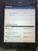
Attached is a picture of the presentation to an iPad
for the url https://www.techspot.com/community/find-new/37251691/posts
and the request headers from the device showing "(iPad; ..."
The picture shows the immense squandering of the display space which is of concern for the mobile user.
for the url https://www.techspot.com/community/find-new/37251691/posts
and the request headers from the device showing "(iPad; ..."
The picture shows the immense squandering of the display space which is of concern for the mobile user.
Attachments
Jad Chaar
Posts: 6,481 +977
The ad is awfully big in the first picAttached is a picture of the presentation to an iPad
for the url https://www.techspot.com/community/find-new/37251691/posts
and the request headers from the device showing "(iPad; ..."
The picture shows the immense squandering of the display space which is of concern for the mobile user.
.We haven't figured out ads on mobile entirely yet. On the desktop we are showing them as usual, tablets are currently inheriting them as is (tweaks will be done eventually), and mobile is without any ads for now.
@Firewalker I hear you, and I agree, but it's those kind of design decisions that look good on paper until you use the site day in and day out.
Wow, thanks for the quick reply and the change to the site. It now shows 3 articles instead of one. I also found dolphin browser that will let me zoom out to 50% so I can actually see about 5 articles on the home page now with comfortable reading text, more closely resembling the desktop version. Good work!
We are using a single responsive site so there's no dedicated smartphone or desktop site but a single adaptable platform. Right now we are showing no ads on the smartphone view.
We are using a single responsive site so there's no dedicated smartphone or desktop site but a single adaptable platform. Right now we are showing no ads on the smartphone view.
Oops, I meant articles, not ads.
D
DelJo63

Mister_K
Posts: 2,278 +1,005
Currently the margin between the nav. bar and news topic titles is very small and the title text is pretty much right under the nav bar. Could you possibly adjsut it by 20-30px?
Example > https://www.techspot.com/news/56387...ce-will-lift-project-loon-to-new-heights.html
Example > https://www.techspot.com/news/56387...ce-will-lift-project-loon-to-new-heights.html
Jad Chaar
Posts: 6,481 +977
Yeah I run exceptions for TS, but with the recent update to the ads, I am tempted to put it back on... but I wont do that since ad revenue makes this site possible.Aha that was a good point, removed adblock for Techspot (might as well, gotta stop leeching) and it seems all fine now. Thanks!
duh! >.<
Similar threads
- Replies
- 23
- Views
- 312
- Replies
- 3
- Views
- 1K
-
TechSpot is dedicated to computer enthusiasts and power users.
Ask a question and give support.
Join the community here, it only takes a minute.